X-Pilates
THE CHALLENGE
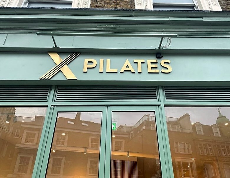
An exciting opportunity came our way when X-Pilates contacted Fastsigns. They were in need of signage for their new studio. They reached out to see how we can help. It was important that the signage match their company colours and have an impressive golden look to it. We followed specific brand guidelines to ensure all requirements were met.
THE SOLUTION
After initial consultation we determined that the client was after beautiful built up letters for their fascia. The logo had a few design elements that meant we had to get creative with how to achieve the desired look. We discussed all the material available to ensure the logo will have the correct golden tone as well as a 3-dimensional feel.
To resolve this challenge, the final result was a logo made from 20mm acrylic flat cut letters, sprayed gold, with flat cut gold brushed stainless steel to the front face. The logo was mounted flush to the fascia with double sided tape. To ensure the logo stands out all day long, a through light coated to the brand specific colour, was mounted above the logo to light it up at night.
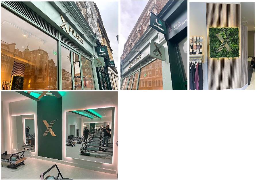
To add to the fascia, a custom projecting sign was made to match the colour and treatment of the main logo. A projecting sign is an important element to a high street location. This type of sign is easily visible from a distance to someone walking by and makes your location easy to find. The projecting sign is a 3mm aluminium square box powder coated to the brand colours fitted with brushed stainless steel letters to the front.
In addition to making the exterior pop we also helped with branding for the interior. Two beautiful flat cut gold stainless steel logos were installed. One flush against the wall in the studio space. The other was fitted in a lovely foliage frame in the reception area. This inviting sign is emphasised by a halo illumination.

THE RESULT
A cohesive brand look from the exterior to interior which adheres to specific brand guidelines. This allows for visitors to be welcomed and transported into a well thought out space with clear brand messaging.