Jack Tizard School
Investing in New Signs and Revamping Current Graphics for a Whole New Look
The Challenge
Since Jack Tizard School in the past, they approached us in 2020 to provide them with some essential safety signs during the peak of the COVID-period. Following the completion of this work, they had an idea to revamp their current school sign. In addition to this, they also wanted to add a few additional graphics around the school yard and entrance way.
The Solution
Jack Tizard School had an existing school sign peeking out over the fence but after years in use, it was in need of a little revamp. Initially they wanted a like-for-like sign. After our sales team evaluated the current sign and location of sign, they started discussions with the client on how to make most of the new sign.
Firstly, we adjusted the size of the panel. To capture the most attention, it was agreed that a slightly bigger sign would have the best impact. We could easily do this, by reusing the existing posts and just fitting a larger panel to the top. Keeping in line with the current styling.
The next point we evaluated was the design and colour of the sign. Looking at the logo and school branding, our sales team were able to advise on some new colour schemes and designs for the revamp sign. Without interfering with the school branding, the new sign design and colour would support the school branding and elevate it.
The main school sign is made from dibond with full colour graphics to the front, cut to shape and fitted with channel fixings to the back for installation to existing posts.
After these points were agreed with the client, the conversation moved on to a few additional signs they wanted around the school.


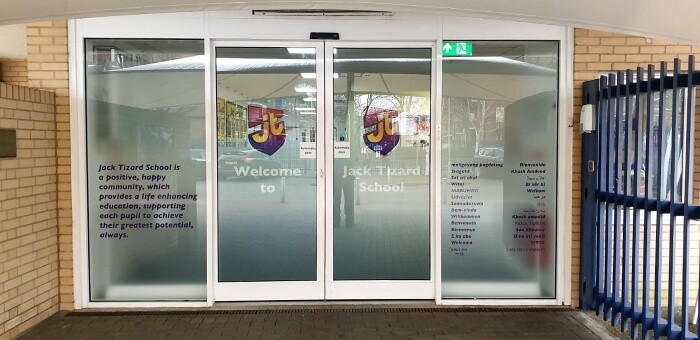
The large glass entrance way was the next focus. This open space creates the perfect opportunity for branding and a warm welcome; and we could easily include safety measures while doing so. Glass panels need to have manifestation on it to ensure the glass is clearly marked to avoid unnecessary accidents. By adding branding to frosted vinyl, you can create a warm welcoming entrance, mark the glass clearly and provide privacy. We achieved this by printing directly onto the frosted vinyl and applied the vinyl to the inside of the glass.
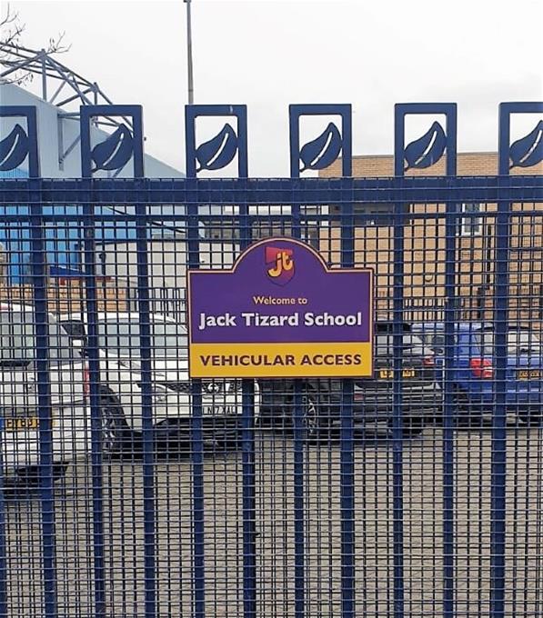
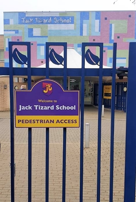
Lastly, we used the large school sign as inspiration to add a few smaller fence signs to indicate alternative entrance ways and messages. These signs were also made from dibond as this is the most durable cost effective solution for outdoor signs.
All the new signs are made in line with the new design and colour scheme established earlier to ensure a cohesive and strong brand throughout.
The Result
The school not only received an updated school sign but almost a complete rebrand. It is now ready to start the new term with a fresh new look without compromising any of its original branding. The new school signs are also more noticeable and clearly marks essential information which will make the school more accessible.
