Santa Maria
Santa Maria: A Signage Success Story
THE CHALLENGE
Santa Maria is a traditional Neapolitan pizzeria with multiple locations across London, known for its authentic pizzas and welcoming atmosphere. When the owners first approached us eight years ago, they were opening their first location and needed a fascia sign that reflected their pizzeria’s personality—simple, sleek, and authentic.

The challenge was to create a signage solution that complemented the calm yet inviting aesthetic of Santa Maria while ensuring their branding was instantly recognizable to customers. Over the years, as the business expanded to new locations, each with its own vibe, they needed creative and cohesive signage that maintained brand consistency while allowing for unique elements at every site.
OUR SOLUTION
For the very first location, we opted for a sleek finish: white flat-cut acrylic letters mounted flush to a light grey fascia. The minimal yet eye-catching design aligned perfectly with Santa Maria’s authentic and inviting atmosphere.

As Santa Maria grew, we collaborated with them to craft distinctive signage for each new location:
-
Ealing: Black flat-cut acrylic letters mounted flush to a white fascia for a bold yet simple look.
-
Slice of Blue: White flat-cut letters on a blue fascia, illuminated with a trough light from above to create a warm and welcoming glow.
-
Islington: Black flat-cut letters with trough lighting, paired with a circular projecting sign featuring acrylic panels that showcased their logo.
-
St Mary’s (Vegan Location): A large, eye-catching stencil on the front door to highlight the unique identity of their vegan pizza offering.
-
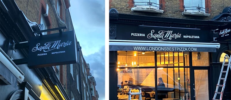
Fulham: A modern twist on their original look, with white flat-cut letters mounted to a dark painted fascia for a sleek and stylish finish.
-
Kew: A bold departure with a bright red fascia and white flat-cut letters, paired with an internal lightbox announcing "Pizza" to draw attention inside.
-
Fitzrovia: A monochrome aesthetic with white flat-cut letters mounted to a black fascia, complemented by a projecting sign tray for added visibility.

Each solution focused on balancing authenticity with visibility, tailoring the design to each location’s unique character while ensuring consistency in branding.
THE RESULT
Over the past eight years, our partnership with Santa Maria has helped them establish a strong and recognizable brand presence across London. Each sign not only serves as a functional element to guide customers but also as a statement of their pizzeria’s authentic and inviting vibe.

From the sleek white-on-grey of their first location to the bold red fascia of Kew, the signage captures the heart of Santa Maria’s identity while standing out in London’s bustling streets. Their pizzerias are now instantly recognizable, and their signage contributes to the warm, inviting experience that keeps customers coming back.
Santa Maria’s success story is a testament to the power of thoughtful, well-designed signage that aligns with a brand’s personality and goals.
