H & F Family Support
The organisation existed, but did not have a presence or image in the community.
 The Challenge
We received an incoming phone call from a new client. They required new centre graphics and company image. The Head Office needed to be branded first – it was a new space for the centre. Following this, there were 4 centres that also needed to be updated to new branding. The organisation existed but did not have a presence or image in the community and wanted to make the space welcoming and informative for both parents and children. Raising awareness in the community.
The Solution
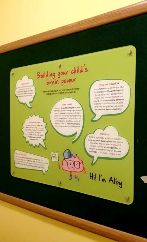
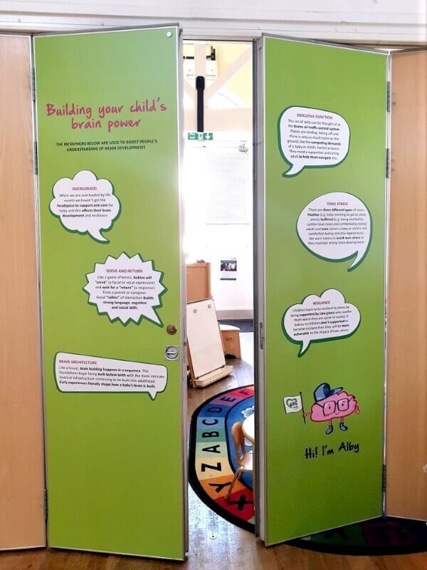
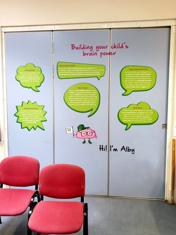
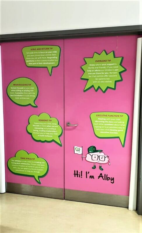
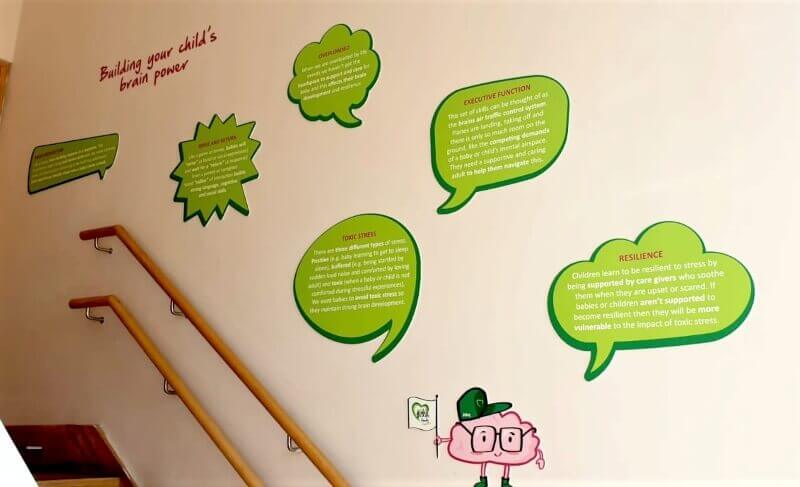
Our starting point was to consult their existing flyer and newly designed logo as well as additional information provided. From this we identified two areas that can be used in the centre décor - the two main categories are: metaphors and tips. The metaphors and tips aim to aid the visitors with helpful information about how a child’s brain works and reacts to situations. We then discussed how to use this information in the most suitable manner.
We adapted the flyer’s ‘metaphors and tips’ to be suited for the application and resolved and designed how to implement it in the spaces. After establishing the look and feel, it highlighted the need to create a relatable character or ‘mascot’ to accompany the text heavy information. This will resonate better with the audience and accompany the otherwise abstract concepts (metaphors and tips) on display. It would also add to and strengthen the brand identity. The character design developed from here. The character had to be bold and bright to be attractive to children. The brief also outlined a few character ideas which were developed into sketches. The brain concept worked best for the client and from there Alby was born.
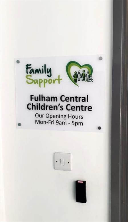
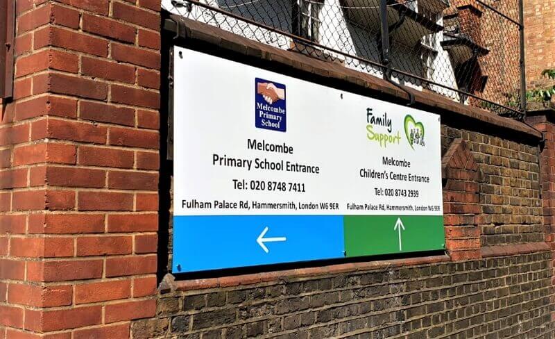
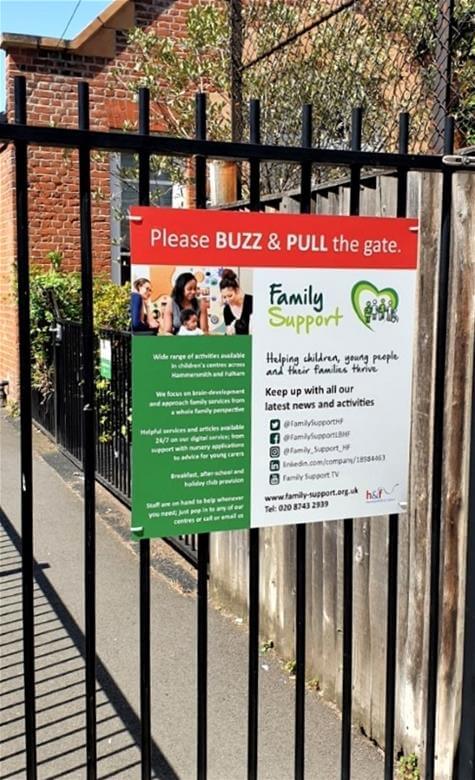
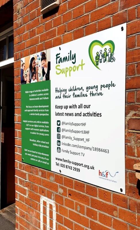
Overall, the signage included interior and exterior graphics, including the Alby mascot throughout the interior. Guiding people into the facility and then educating them once inside. Making the space unique to their needs and more engaging and interactive. Each space was surveyed and individual proposals were put together to make the best use of the graphics in each space. The signage includes room signage and information boards and “what’s on” snap-frames, opening hours and contact information. The signage material compromise of Dibond panels with Foam PVC flat cut details. Flat cut logo including text, logo and character. Acrylic and Foam PVC prints. Snap-frames, large scale wall graphics, room and door graphics. We also supplied and installed six digital screens across all the centres.
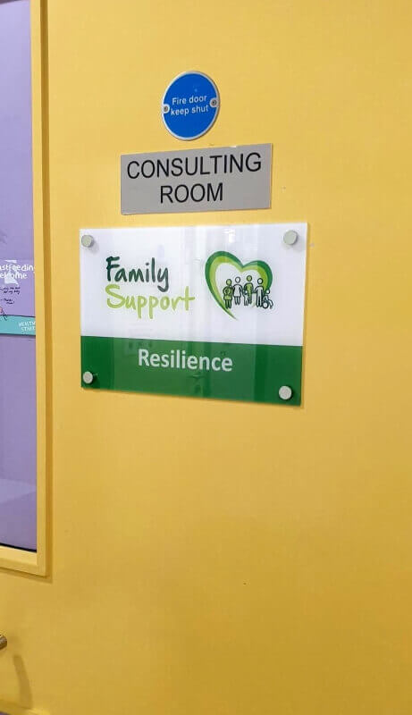
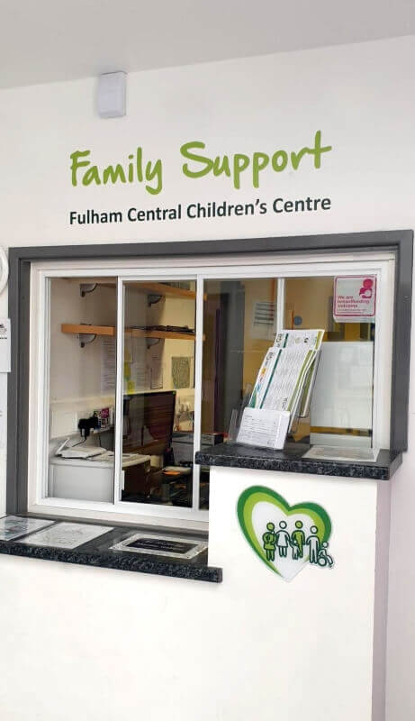
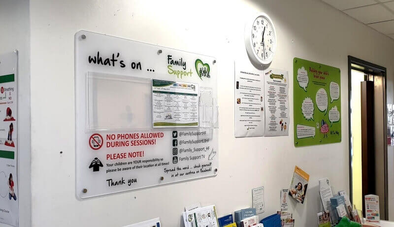
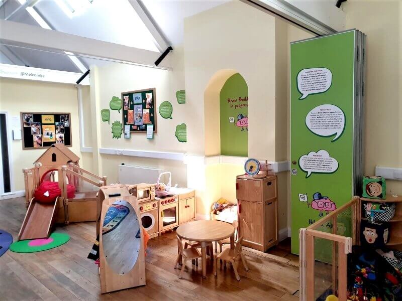
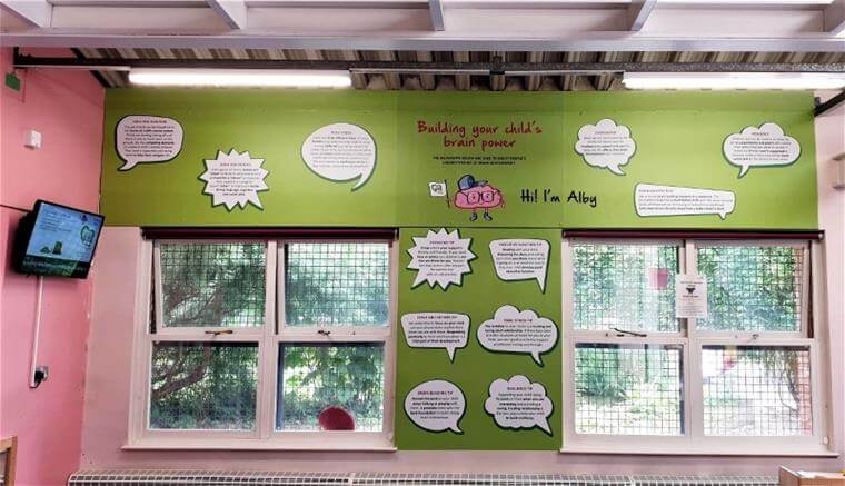
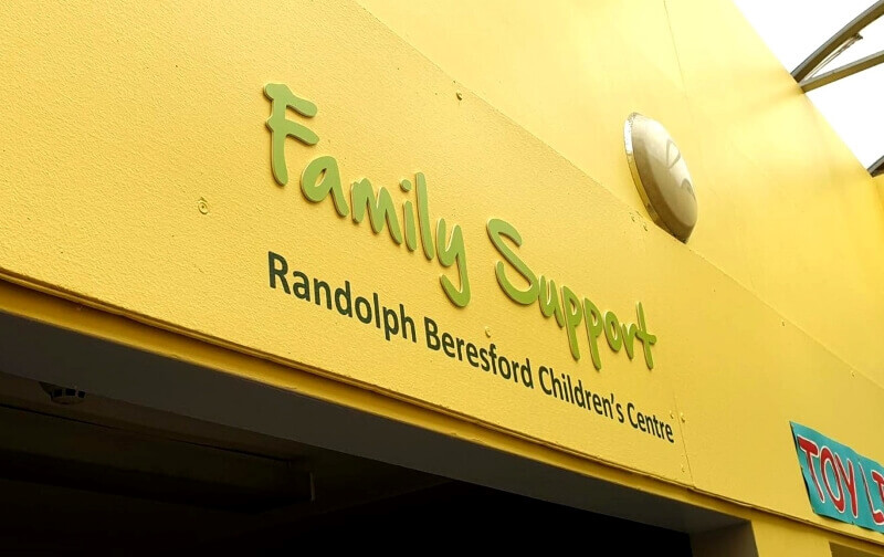
In addition to this, we helped to introduce the concept of privacy to their facilities. After consulting with the client, our experience and knowledge helped to identify this key factor that was missing. We used frosted vinyl to certain areas to allow for private rooms in the space.
The Result
Centres received lots of positive feedback from their visitors – who find the space welcoming and informative. Other children support centres from neighbouring boroughs have commented on the positive outcome and expressed keen interest in the concept for their own centres.
“FASTSIGNS did an amazing job when it came to every aspect of this work. From working with us on each site to help create our vision and bring creativity during the design process. The visuals supplied were great in helping us really imagine what the signs would look like and they were always happy to go the extra mile, especially during installation” – Emma Best (Communications Manager).