
The Barkside
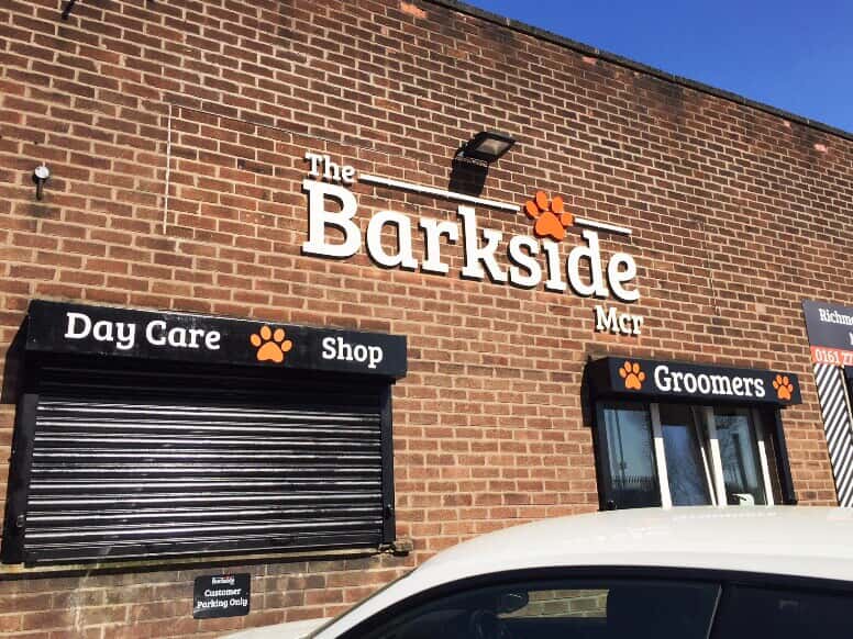
The Barkside wanted to commission us to design an address sign that would sit above the shutters, along with a logo for the exterior wall.
The Barkside is a fast-growing dog grooming service, based in Manchester. After successfully establishing a day care centre in the city, The Barkside set up a second facility for dog grooming. Following a recommendation, they approached FASTSIGNS® Manchester with several requests that we were able to support them with.
.jpeg)


Challenge
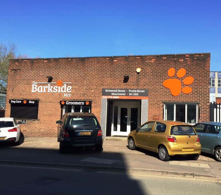
The Barkside wanted to commission us to design an address sign that would sit above the shutters, along with a logo for the exterior wall. After the initial sit-down, FASTSIGNS® Manchester went away to do our research, which included an audit of the client’s website and social media channels.
Their paw print logo was currently consigned to the ‘i’ in the brand name. We thought it would make a vibrant and distinctive wall feature. Some of our clients come to us with an aesthetic idea, rather than a functional one; this was the opposite. Lauren and her colleagues knew that they wanted to convey information, but weren’t sure how to do it.
Additionally, we learned that the inside of the premises was stacked with great imagery. The outside simply had to look just as good, to attract more customers in for a grooming session and let them see The Barkside’s amazing interior for themselves.
Solution
We proposed a flat-cut acrylic logo for the wall, vinyl lettering above the main and smaller shutter boxes, and a big acrylic sign for the orange paw print. A new door surround would also hide some unsightly brickwork. We composed our ideas into a PDF, with each element labelled and laid upon the existing façade, so the client could see exactly how the concept would look once in place.
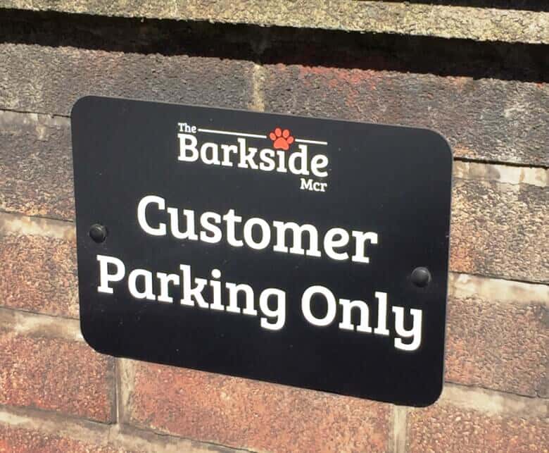
Seeing how we had managed to solve the problems that Lauren didn’t know she had, it was at this time that we were told about a parking issue. Dozens of football fans would often pull up outside the building for match day, which blocked access to the building. To rectify the issue, we offered to make a sign that read ‘The Barkside customers only’ in the brand’s signature font, politely reminding people to park elsewhere.
Result
Delighted with our solution, The Barkside gave us the go-ahead on the project. Our team then moved quickly to deliver the results. The entire front of The Barkside’s premises was completed in five days, from approving the plan to full installation.
We stayed in communication before, during and after the project was underway, ensuring the fittings went smoothly and that The Barkside team were happy at every stage.
We were extremely proud of the results. The paw print is a bright, fiery orange. A black and white scheme helps the font claim attention, and is in tune with the brand’s colour palette. Two signs now deter non-customers from taking up valuable parking spots.
The Barkside were so pleased, they shared our work on Instagram and Facebook, with a wonderful quote that hoped “all companies could be the same!”