It is often said that the signage your business uses is like having a silent salesperson, constantly trying to attract the attention of your potential customers. It's the first impression you make, and in a split second it can tell them so much about what you and your brand stand for. Getting how you communicate this opening message in your sales journey right is so important.
Choosing the right font is one absolutely crucial element in this. An appropriate typeface can elevate your message or it can leave your customers confused and floundering. Or even worse, it can make you totally forgettable.
So let's delve into the world of typography and explore the best and worst fonts you can choose for your business signage – and why.
Your First Team Fonts:
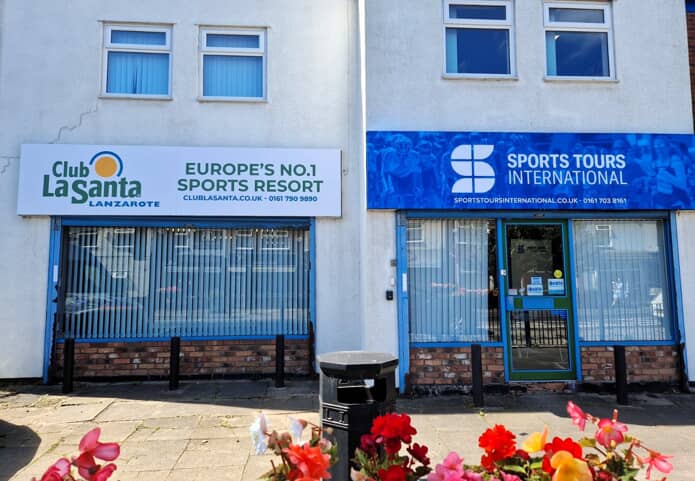
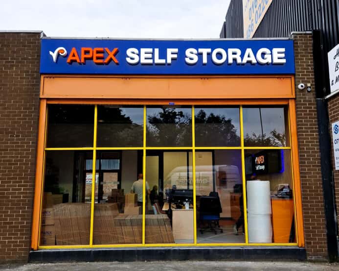
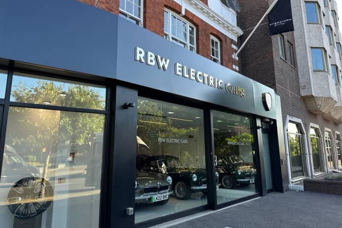
- Sans-Serif for Clarity: Sans-serif fonts, like Helvetica or Arial, look clean, modern, and importantly are highly legible. They're perfect for conveying essential information on your sign, especially in areas with high footfall. Their simplicity allows for clear communication even from a distance. These qualities add up to make them the ideal choice for conveying business names and short taglines.
- Serif for Sophistication: Serif fonts, like Times New Roman or Garamond, on the other hand create a sense of elegance and tradition. They're perfect for businesses that need to project an air of trustworthiness and heritage. These fonts work well for legal firms, financial institutions, or establishments that want to trade on their long history.
- Script for Personality: Script fonts, like Lucida Script or Kaufmann Script, can add a touch of personality and charm. They're particularly well-suited to businesses like cafes, boutiques, or wedding planners, where a personal touch of elegance and even relaxation is important. However, these virtues come with a potential cost: use script fonts sparingly, as over-reliance on them can lead to legibility becoming more difficult.
The Fonts Waiting on the Bench:
These are fonts you’ll want to use more cautiously as generally they won’t be your first choice. But in special circumstances they can be brought on to do the job when other fonts look tired and ineffective.
- Decorative Fonts: Whilst decorative fonts like Papyrus or Curlz might seem attractive in isolation, they can be difficult to read and detract from your message when used over a whole sign. Keep these fonts for use for very specific situations, like a temporary holiday banner or a quirky logo design, where legibility probably isn't going to be your primary consideration.
- All-Caps Shouting: Using ALL CAPS in any font can make your sign look aggressive and as hard to understand as a tanked-up fan on late on a Saturday afternoon. Remember, you want to entice customers, not scare them away. Consider using a mix of upper and lowercase letters for increased readability. However, all-caps fonts when professionally designed can work exceptionally well for short, impactful wording.
The Relegation Zone:
These are some font types we’re all likely to want to see the back of:
- Comic Sans for Playgrounds: Comic Sans, a font originally designed for comic books, is vastly overused, often misused and leaves us feeling abused. While it might be fun for a children's play area, it lacks that professional look and can make your business appear ‘unserious’.
- Difficult to Decipher: Fonts with excessive flourishes or overly condensed lettering belong on a graphic designer's playful experiment board, not your business sign. The goal is for people to understand your message instantly, not spend time deciphering cryptic lettering.
The Power of the Right Font
Beyond what works aesthetically, you are likely to want to think through issues such as customer psychology and good marketing practice when selecting a font to use:
- Font Psychology: Research suggests certain fonts evoke specific emotions. For example, rounded fonts like Gill Sans are perceived as friendly and approachable, while sharp, angular fonts like Futura create a sense of modernity and technological progress. Understanding these associations can help you choose a font that aligns with your brand personality and will make instant sense to your target audience.
- Brand Consistency: Your font choice should be consistent across all your marketing materials, from signage to website to social media. This brand consistency builds recognition and reinforces your brand identity in the minds of potential customers.
Work With a Sign Maker to Choose Your Fonts Wisely
So selecting your optimal font requires you to keep a number of considerations in mind. A professional sign maker will be able to help you balance these and choose the solution that’s going to work best for your business.
Here are a few ways in which professional advice will add value to your selection:
- Expertise in Legibility: A sign maker will assess your location, target audience and optics before recommending fonts optimised for legibility within the constraints of your chosen location.\
- Brand Alignment: A sign maker can guide you in selecting a font that resonates with your brand personality and target market. They will suggest fonts that help nudge your customers towards sales conversion by creating a cohesive brand image.
- Technical Knowledge: Professional sign makers understand how different fonts translate onto various materials. They can recommend fonts that will look crisp and clear on your chosen signage material, ensuring a high-quality final product.
The Final Word: Your Sign Speaks Volumes
Your business signage is a crucial tool that speaks volumes about your brand. By understanding the best and worst fonts, keeping psychological and marketing considerations in mind, and working with a professional sign maker, you can create a sign to grab your customers’ attention and leave a lasting impression. Remember, your sign is an ambassador for your business, so choose the voice your customers will hear wisely.