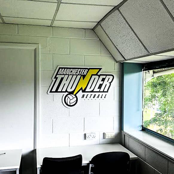
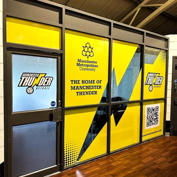
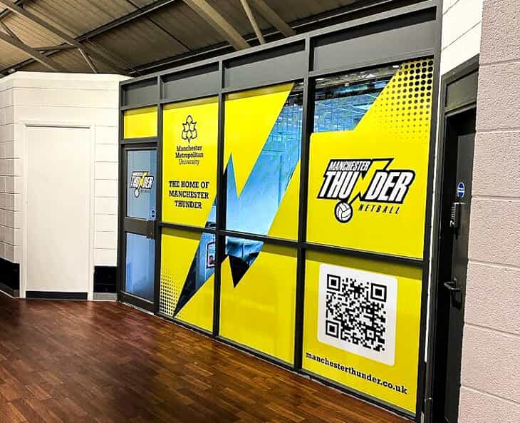
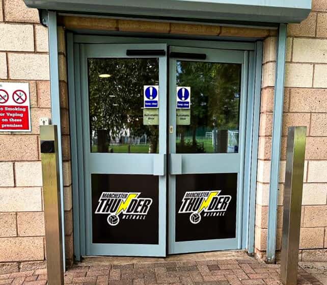
One of the ways we at FASTSIGNS Manchester like to serve our community has been by taking requests to build signs for you based on your favourite sports clubs. Your requests keep on coming and we are delighted to oblige!

But have you ever thought what makes up a good logo or badge for a sports club? And how you would go about designing one yourself?
Well, wonder no more… We’re here to let you in on the trade secrets.
So let’s say you're the manager of a local sports club here in the North West, rallying the troops for Saturday's crunch match. You've got the tactics sorted, the team spirit's high, but something feels off. Your club, for all its northern grit and determination, is missing that final something – a killer logo that truly embodies your team's spirit and will lead you to another glorious victory!
But you’ve got this covered. You know why? Because designing a great logo is like crafting the perfect game plan – it needs strategy, tactics, a bit of creative flair, and an understanding of what will impress your loyal supporters out there in the stands.

Here at FASTSIGNS Manchester we know a thing or two about creating impactful visuals. So, let's jump feet first into the world of sports club logos and explore the key factors that make a crest worthy of true champions:
- Knowing Your Colours: Colours are the cornerstones of any sports club's identity. They're on your kit, they're emblazoned across the stands, and they're the first thing that pops on a logo. Choose colours that not only represent your team but also evoke emotions. Think of Manchester United's iconic red – a symbol of power and determination. What particular emotions Manchester United evoke for you personally is something we won’t go into here…
A Nod to History (If You Have One): Your club's long and proud history stretching back decades, years, months…. is what really sets you apart. Does your team have a fierce rivalry with another local club? Was it founded by a group of factory workers with a love for the beautiful game? Incorporate elements of that history subtly into the logo. Maybe it's a nod to a local landmark or a local delicacy. Your year of foundation also looks great when woven into the design. This adds a layer of depth and connects the logo to the club's heritage.
Keep it Simple: We all know in sport simple but effective is usually the best tactic. Avoid intricate details and cluttered designs Your logo needs to be instantly recognisable, even from afar. Think of the iconic three lions – a simple yet powerful image that resonates globally.
Nature's Natural Leaders: Animals have been mascots of sporting prowess since man (and woman) first kicked a spherical object. These three lions represent courage. Eagles symbolise soaring ambition whereas horses embody raw speed and athleticism. Choosing an animal mascot can be a great way to add personality to your logo. However, overused creatures like lions and eagles might not necessarily be your best bet. How about a more unique animal that reflects, say, your local area or your club's fighting spirit?
Keep it Short and Sweet: The name's the game, quite literally in this case. Include your club's name in the logo, but keep it to the point. Opt for a clear, bold font that complements the logo's design and is easily readable at a number of sizes – on your players’ shirts to over the entrance to your ground.
A Touch of the Modern: Just like tactics evolve, logos need to keep pace with the times. Consider incorporating a subtle modern touch – a clean line, a contemporary font, or a colour gradient that reflects current design trends. But remember, fads fade faster than a winger in late middle age. Aim for a classic design with a touch of youthful flair.
Think Beyond the Pitch: Your logo will adorn your club's shirts, website, and social media pages. But will it look like on a banner, a team bus, or even a pint glass? Ensure your logo looks great wherever you’re going to want to use it and consider how it will translate to different mediums like embroidery or printing.
We're on Your Team! Designing a logo can be a game of two halves – inspiration and execution. Don't be afraid to seek professional help. Here at FASTSIGNS Manchester we have a team of experienced designers who can help you translate your club's vibe into a winning logo. We can guide you with colour choices, suggest successful layouts, and ensure your logo is designed with versatility of a champion decathlete.
The Final Whistle:
Remember, your sports club logo should be more than just a logo. It should be a symbol of pride, a rallying point for fans, and a badge of honour for your players.
By following these tips you too can create a logo that inspires your team, is taken to heart by your supporters, and leaves a lasting mark on the local sporting scene.
After all, a strong logo is like a winning goal – it stays with you long after the final whistle blows.

