The name of one brand today remains synonymous with Greater Manchester’s proud and pioneering industrial past: the Co-operative Group, or simply, the Co-op.
A name that has been in the national news a lot of late with the – admittedly not always smooth – opening of Manchester’s new indoor arena, the Co-op Live.
So as proud fellow Mancunians, let’s celebrate the brand’s rich history and explore how inextricably linked this brand and its signage is with the development of the city we know today!
Early Days: Roots in Cooperation (1864 - 1940s)
The Co-op's story begins in 1864. Inspired by the Rochdale Pioneers, a group of weavers who established a cooperative grocery store, working-class residents of Rochdale founded the North of England Co-operative Society.
The initial focus was on providing affordable food and household goods to working families.
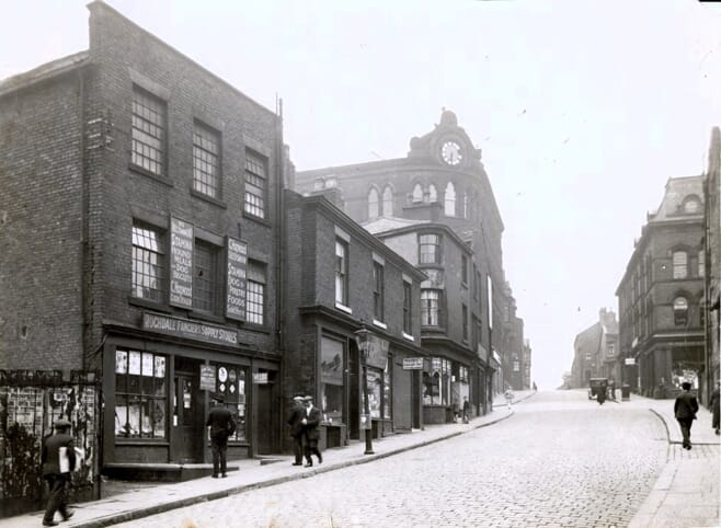
Signage in this period was a far cry from what we expect today: simple, hand-painted signs bearing minimal information or what we think of now as brand identity, displayed on the outside of the premises.
The first store, located in Toad Lane, Rochdale, is preserved today and bears a sign with the word ‘Store’ in gold lettering on a plain green background above its entrance.
The Cloverleaf: A Symbol of Unity (1947 - 1968)
In 1947, the Co-op adopted its first national logo – the now-iconic cloverleaf. Designed by the CWS Design Group, it symbolised unity and strength. Each leaf represented the society's core values: Cooperation, Education and Equity.

This period also saw a shift in signage. Standalone Co-op stores became more prominent, featuring the cloverleaf logo prominently displayed on shopfronts and also painted onto delivery vehicles.
Signage and brand consistency was becoming increasingly mobile!
Manchester's Buzz: The Beehive Makes a Mark (1940s - 1960s)
While the cloverleaf was the national logo, Manchester held a special connection to another symbol – the beehive.
Employed by the Co-operative Wholesale Society (CWS), the regional arm of the Co-op, the beehive represented the collective effort and industriousness of the cooperative movement.
These beehive signs, often painted on brick walls or displayed on enamel signs, became a familiar sight in Manchester, particularly near Co-op warehouses and factories.
Modernisation and the Shopping Basket (1968 - 1993)
By the late 1960s, the Co-op was undergoing a drive towards wholesale modernization. The cloverleaf logo was updated to show cleaner lines and a brighter colour scheme. It was accompanied by a new symbol – a shopping basket.
This shift reflected the Co-op's evolving role, now having to compete in a world of much greater consumer choices available elsewhere to its customer base.
Signage in this period by prominently incorporating the new logo and shopping basket exemplified the Co-op’s efforts to remain competitive in the more modern, consumerist age.

Returning to the Roots: The Cloverleaf's Rebirth (1993 onwards)
In 1993, the Co-op underwent a significant rebranding. The cloverleaf logo was modernised once more, this time with thinner lines and a more rounded design. Also, the decision was made to phase out the shopping basket symbol and return to the cloverleaf as the sole brand identifier.
This move was interpreted by many as a return to highlighting the Co-op's core values and community focus.
Signage in this period reflected this shift, with the simplified cloverleaf taking centre stage on all Co-op stores across Greater Manchester.
The Co-op Today: A Hive of Innovation and Community
Today, the Co-op remains a vital part of Manchester's social and economic landscape. It operates a large network of stores across the city, one of a number of established chain supermarkets competing to win the patronage of local residents.
It continues to play a vital role in community initiatives, asking customers to select one of a number of local charities to receive support.
The Co-op's signage continues to evolve in the digital age. While the cloverleaf remains the central symbol, digital displays and interactive kiosks are increasingly used to engage customers and communicate promotions.
The beehive symbol, while no longer officially part of the Co-op branding, still resonates with many Mancunians, a reminder of the cooperative movement's strong local roots.

A Legacy Forever Rooted in Manchester
The Co-op's journey and the evolution of its brand logo that dominates its signage mirrors Manchester's own transformation over the past two centuries.
From its humble beginnings as a symbol of working-class solidarity to its modern incarnation as a prominent national retailer, the Co-op remains a constant in our cityscape.
Its latest venture, Co-op Live, serves to showcase that close bond not just locally, but to the world at large.