Let's face it, signage is more than just a pretty picture. It's your silent salesperson, the directional guide and brand ambassador all rolled into one.

But just like that awkward first date where everything goes wrong, signage can sometimes fall flat on its face. Don't worry, we’re here to give you a few examples of how not to do it and a list of things to bear in mind if you’re making your own!
The Hall of Signage Shame: When Good Intentions Go Wrong
We've all seen them – the typos that make you do a double-take, the confusing layouts that leave you scratching your head, or the poorly lit signs that disappear into the night. Here are some all too familiar examples of things going horribly wrong:
The Run-on: ‘Please Use Caution When Hunting Pedestrians Using Paths’ – we’ve all seen signs like these that are unintentionally hilarious. Signs usually don’t use punctuation so how words are placed on them is really important. If they’re not placed properly the reader may find it difficult to know how to split up the message being relayed into its intended parts!
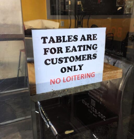
- The Lost in Translation: When signs don’t quite get their English sounding right the message may still be clear but it may end up also being very funny. This is often the case when the sign makes perfect sense in another language but less so when translated literally into English. How about the classic ‘Tables For Eating Customers Only’?
The Information Overload: Ever seen a sign with so much text, you need a magnifying glass to read it? Less is definitely more when it comes to clear communication.
Going Over the Top: Picture a clash of colours that makes your eyes water, or a font so fancy it's unreadable. Consistency and clarity are key in creating visually appealing signage.
The "We Tried, Really" Award: We’ve all seen the enthusiastically homemade sign with wonky lettering, peeling paint and the final letters crammed into the bottom right corner. Don’t do this, folks. Professional signage really does go a long way in projecting a polished and trustworthy image for your business, however small and homely.
Avoiding the Laugh Lines: How to Create Stellar Signage
Now that we've had a chuckle at some unfortunate mishaps, let's get serious about crafting signage that shines. Here are some tips to ensure your message lands loud and clear:
Know Your Audience: Tailor your message to your target audience. Consider their age, background, and what information they need most.
Simplicity is Key: Keep it clear and concise. Prioritise the most important message and use simple, easy-to-read fonts.
Embrace the Power of Design: Professional design goes a long way. Take expert advice on colours that complement your brand and a layout that's easy to navigate.
Location, Location, Location: Consider placement carefully. Your sign needs to be visible from the right distance and under the right lighting conditions.
Think Long-Term: Use high-quality materials that can withstand the elements. A sign that looks good today shouldn't look faded and weathered tomorrow.
Proofread, Proofread, Proofread: This might seem obvious, but a typo can change the entire meaning of your message. Get a fresh pair of eyes to review before finalising the design.
Look Out For Unintended Meanings: You know what your sign means but can it be read in a different way making your message confusing or downright hilarious’ Look out for unintended sexual innuendos with the mind of a teenage boy.
Seek Expert Advice: Don't be afraid to consult a professional signage company. We can help you navigate the legalities, material choices, and design considerations to create signage that's both effective and eye-catching.
Why All This Matters: Signage for a Successful Business
Signage goes beyond simple information displays. Avoiding signage mishaps is crucial in communicating the right message for your brand. But what are some of the unwanted outcomes of unprofessional signage?
Sacrificing a Great Brand Identity: Poor signage reflects poorly on your brand. You may have taken years to build up a great brand identity then shoot yourself in the foot by promoting it with a memorably awful signage mishap that risks being what people remember about you, not the excellence of your product.
Alienating Customers: Clear signage helps customers navigate your premises easily and associate doing business with you with a positive experience. Signage that confuses, offends or makes you look unprofessional are surefire ways to alienate your customers.
Underselling Products and Services: Substandard signage will inevitably be seen as an indication of a more general lack of quality and professionalism at your business.
Failing to Comply with Regulations: Remember, there are regulations regarding signage size, placement and lighting in the UK. Signage professionals, such as FASTSIGNS Manchester, can ensure your signs comply with all legal requirements.
The Final Word: Signage that Speaks Volumes
Signage plays a crucial role in the success of any business.
By avoiding common pitfalls and using these tips, FASTSIGNS Manchester can create signage with you that not only informs but also captures attention, builds brand recognition and ultimately, drives sales.
Let your signage be the silent hero, quietly doing its job, not drawing unwanted attention to itself as a future "signage disaster" story!

