The pace of modern life means we make snap decisions about businesses and brands all the time. We do this by picking up subliminal cues that influence our judgements without us even noticing. Colour is often the first thing we notice about a brand. Whether it's a logo, a website or a shop sign, the colours used can tell us a lot about a company's personality and values.
At FASTSIGNS® Leeds, we've spent nearly three decades helping local businesses harness the power of colour in their visual communications. In this blog, we’re looking into what your colour choices say about your brand, the qualities associated with each colour and how you can choose colours that make your brand shine.
Understanding colour psychology in branding
Colour psychology refers to the ways different hues can influence human behaviour and decision-making. It has huge potential to be harnessed in branding and marketing; research has shown that colour can influence a lot, from our perception of quality to our chances of making a purchase.
But why does colour have such a strong impact? It comes down to how our brains process visual information. Colour is often the first thing we register when we see something new, and it has the power to trigger strong emotional responses. That means getting the colours right when it comes to your signage can have a huge impact on the way people see your brand.
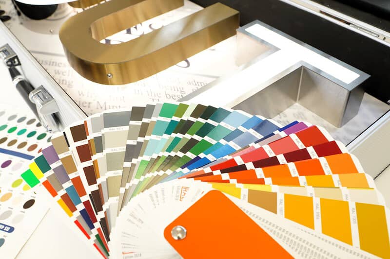
Exploring the colour spectrum
Although your brand colours may seem like a superficial detail, they can say a lot about your business and its values. Think about it: when was the last time you saw a plain sign or advert that wasn't a deliberate statement? We're guessing it wasn't hugely compelling.
Let's take a look at what specific colours can communicate about your brand:
Red: energy and excitement
Red is a powerful colour often associated with energy, excitement and passion. Brands that use red often want to be perceived as dynamic and confident.
Impact: Can create a strong sense of urgency.
Best for: Calls-to-action, sale signage, brands that want to convey excitement.
Tip: While effective, too much red can be overwhelming.
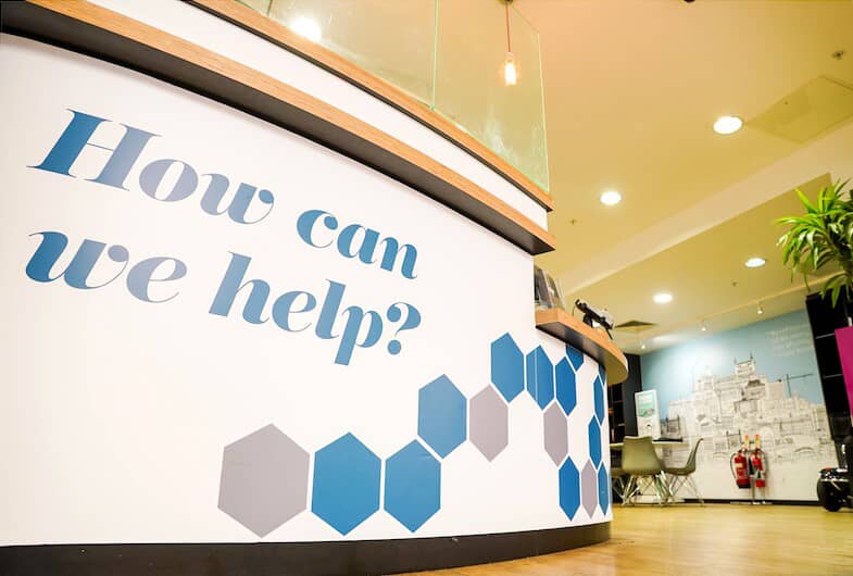
Blue: trust and stability
Blue brings to mind feelings of stability and depth, which is why it’s very popular with corporate brands. It’s often used to show professionalism and trustworthiness.
Impact: Helps people feel calm and secure.
Best for: Banks, healthcare providers, tech companies.
Tip: Different shades of blue can say different things – light blues feel fresh while darker blues look more professional.
Green: growth and balance
Green has very strong links with nature, making it a great choice for brands that want to highlight growth, harmony and care for the environment.
Impact: Makes people think of balance and growth.
Best for: Eco-friendly products, health foods, schools.
Tip: Green is thought to be one of the easiest colours for our eyes to process, so it’s great for signs people will look at for a long time.
Yellow: optimism and friendliness
Yellow makes us think of sunshine, warmth and positivity. It’s an eye-catching colour that brings out feelings of optimism and clarity.
Impact: Helps brands look cheerful and approachable.
Best for: Grabbing attention in busy places.
Tip: Yellow can be hard to read, so it’s best to use it sparingly or as a highlight colour.
Purple: creativity and luxury
Purple has long had links to royalty, and today it’s often used to show luxury, wisdom and creativity. Brands that use purple often want to look premium or innovative.
Impact: Can spark creative thinking.
Best for: Luxury products, high-end shops, creative businesses.
Tip: Purple is very rare in nature, which can make it really stand out in marketing.

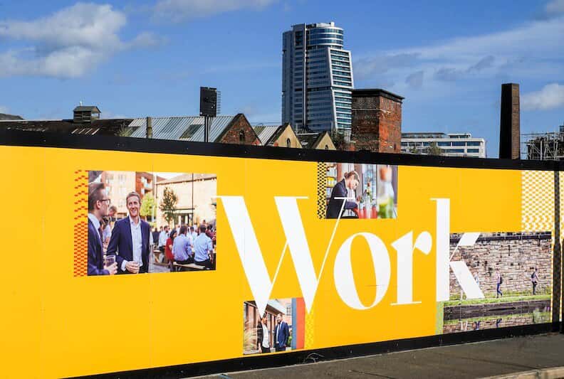
Orange: confidence and playfulness
Orange blends the energy of red with the cheerfulness of yellow. It often comes across as friendly, confident and adventurous.
Impact: Can encourage enthusiasm and action.
Best for: Brands targeting young people or wanting to look fun or affordable.
Tip: Orange works well as an accent colour to draw attention to specific elements of your signage.
Pink: nurturing and youthful
Pink is often associated with femininity, but it can also create a sense of warmth and emotional connection for all genders.
Impact: Can evoke feelings of youthfulness and compassion.
Best for: Brands wanting to appear caring, gentle or trendy.
Tip: Different shades of pink can vary from playful to sophisticated, so choose carefully.
Brown: stable and dependable
Brown is an earthy colour that suggests strength and reliability. It can make a brand feel grounded and trustworthy.
Impact: Conveys a sense of stability and comfort.
Best for: Brands related to nature, outdoor activities or craftmanship.
Tip: While dependable, brown needs to be used thoughtfully to avoid looking dull.
Grey: balance and expertise
When grey is used deliberately, it can suggest balance and knowledgeability. A grey or silver logo is very neutral and can exude a certain level of expertise.
Impact: Helps create belief in the capabilities of the business.
Best for: Professional services, tech companies or brands aiming for a modern look.
Tip: Used ineffectively, grey can look boring, so balance is key.
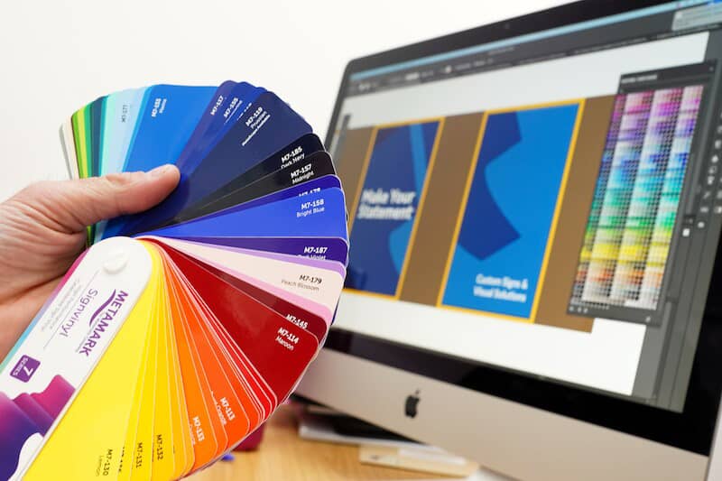
Using colour in your branding and signage
Understanding colour psychology is just the first step. The real skill is applying it to your brand identity. Here are some key things to consider when using colours in your business signage:
Know your audience. Different groups might react differently to colours. Look into what your target market likes and is drawn to.
Think about your industry. Some colours are very common in certain industries, but don’t be afraid to stand out – just make sure your choice fits with your brand values.
Consider the surroundings. Where your sign will be displayed can affect how the colour looks. Think about the lighting and what colours are surrounding it.
Be consistent. Once you’ve settled on your brand colours, use them the same way everywhere, from your website to your shop signs.
Think about accessibility. Make sure your colour choices don’t exclude people who see colours differently. Good contrast is always key for readability.
How FASTSIGNS Leeds can help
At FASTSIGNS Leeds, we're experts in visual communication. We know that your signs are often the first real-world encounter a potential customer has with your brand. That's why we're committed to helping you make a great first impression.
Smart, appealing signage in the right colour scheme helps you to consistently make a strong impression on customers, prospects and passers-by. Our team of skilled experts can help you create eye-catching signs that use colour psychology to help you reach your business goals. We’ll help make sure all your visual branding looks the same, from outdoor signs to indoor graphics. Whether you're rebranding, launching something new or it’s just time to refresh your look, we're here to help you make a statement with powerful, well-designed signs.