The right restaurant signage sets the tone for your establishment and helps draw in customers. Discover the three principles for creating effective restaurant signage in this blog from industry-leading sign-makers, FASTSIGNS® Leeds.
We’ve all heard the phrase ‘you eat with your eyes first’ and many of us will appreciate that when something looks delicious, you’re more likely to consume it. If you’re served a plate of food in a restaurant, you’re going to be more excited if it looks beautiful rather than bland, right?
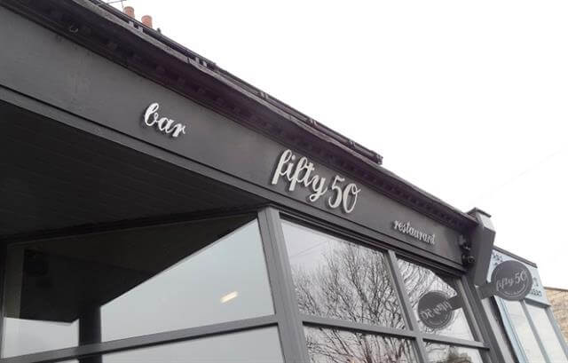
The same can also be said about the restaurant exteriors. If an establishment looks smart and inviting, you’ll have more faith that the food they serve will taste good too. Equally, a tired, shabby front of the house can be a warning sign.
This is just one of the reasons to make sure you have the right restaurant signage. A sleek exterior can make all the difference between drawing in the crowds and driving them away. Here are three ways signage can help you make the right impression below:
1. Create curb appeal
Whether your restaurant is in a busy location or not, a good proportion of your business will be generated by customers walking in off the street, so it’s important to make a good impression on passers-by.
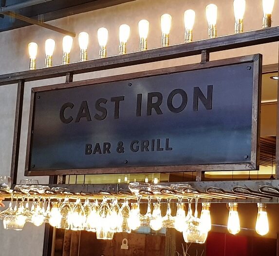
Choosing signage that’s clear and eye-catching is an invaluable place to start. Opting for quality materials, like wood or metal, for instance, can help your signs to really stand out. And choosing a stylish finish, like embossed or cut lettering, can elevate your exterior ahead of the competition.
Another good tactic is to illuminate your signage, either from behind or by using down/up-lighting lamps. This not only looks inviting but helps to get you noticed at night-time too.
2. Show people what you’re about
Visiting a restaurant, bar or café is about more than food, it’s about the experience. Whatever the style of your establishment, be it fast food or high-end, customers want to share and experience something enjoyable and memorable.
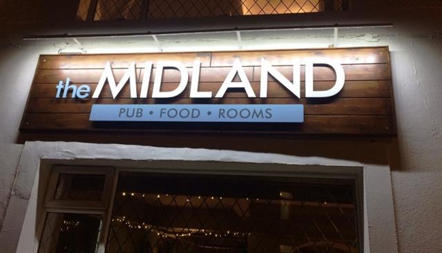
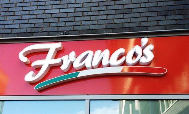
Your external signage presents a valuable opportunity to show the outside world what you’re all about. Fonts, colours, icons, and images can all be used to reflect your brand identity and give customers a sense of what to expect.
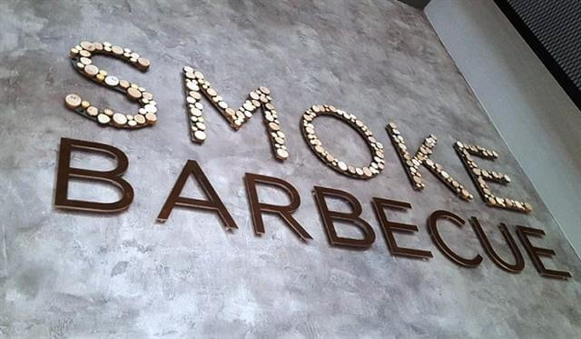
There’s the obvious example of using fish for a chip shop or chili pepper for a curry house, but you could go a step further. This BBQ restaurant opted for a handmade wood and steel combination to reflect their rustic grill menu.
Once you strike the right tone, your exterior can become an enticing beacon, drawing people indoors with the promise of what’s within!
3. Stay up-to-date and excite your customers
There’s nothing duller than a dilapidated, dated display that no longer reflects your business. But more than that, it can be misleading….
If you share menus, specials, or offers using signage, it’s important to keep it up-to-date. If customers are regularly finding their options limited compared to what’s being advertised, people may begin to leave dissatisfied.
Chalk menu boards provide a traditional touch and are really useful for sharing news and offers. What’s more, they’re really easy to update. Digital signage gives you the flexibility to display a whole range of offers, menus, and animated advertisements – all from one place.
Sharing regular messages is the best way to keep your customers and staff informed, but it also helps keep your front of the house in order too. An attractive, up-to-date display shows you care about refining your offering and says ‘we’re a restaurant that’s moving in the right direction!’
Smart signage can impress new customers and keep returning guests coming back for more. Do you think your restaurant signage could do with a refresh? Get in touch if you have an inquiry and see how we can help you with our leading signage know-how.