Discover what different colours could say about your brand or business in this blog by visual communications experts FASTSIGNS® Leeds.
The pace of modern life means we make snap decisions about businesses and brands all of the time. We do this by picking up subliminal cues that influence our judgements without us even noticing.
Colour is one such cue. Colour choices are everywhere we look, particularly when it comes to branding and advertising.
Think about it, when was the last time you saw a plain sign or advert (that wasn’t a deliberate statement)? We’re guessing it wasn’t hugely compelling.
So, what do your colour choices say about your brand? And what particular qualities are associated with each colour?
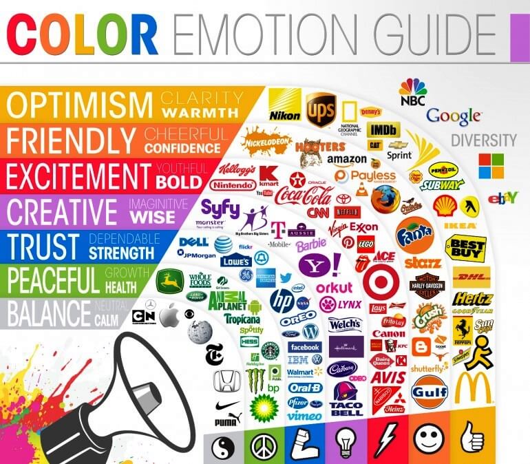
Well, on the whole, they fall into these 7 categories:

Photo credit: CoSchedule
Yellow
As well as being bright and eye-catching, yellow is perceived as warm and welcoming, and is typically associated with optimism. Yellow carries a certain positivity that makes it work for brands who are looking to position themselves as reliable, forward-thinking and helpful.
Orange
Not dissimilar to yellow, orange is a bright, cheerful and friendly colour. But it’s also associated with a certain added confidence and playfulness that distinguishes it. This colour is often perceived as a motivational colour and brands associated with it may be challengers in their marketplace.
Red
In the natural world, red represents danger. In the branding world this is spun to represent excitement. Red is energising and bold, so you might see a red logo and think of brand leaders. Although red invites a certain level of trust and confidence, it should be used carefully to avoid triggering its negative connotations.
Purple
In its various forms, purple is associated with creativity. Traditionally, purple is a very spiritual and stimulates our imagination. Brands who use purple may wish to show they think outside of the box and offer a certain level of originality. Very deep purple tones take this originality a step further and can be used to create a sense of exclusivity and luxury.
Blue
Blue is commonly used in branding, particularly in the corporate world. This is largely due to the sense of reassurance it generates. Blue is used to signal strength and dependability – without the risk associated with red – and businesses who choose blue as their core colour are likely to be trying to display stability and trustworthiness.
Green
We think of nature and the environment when we see green, and brands use this to channel health, growth and equilibrium. It’s a colour that is energising and seen as a sign of life, so it may be used to signal activity and progress. A positive colour, green can encourage into action.
Grey
When grey and black are used deliberately, they are used to signify balance and knowledgeability. The neutrality of a grey, black or silver logo exudes a certain level of expertise and invites you to believe in the unique capabilities of the business behind it. But used ineffectively, black or grey can look unremarkable.
Although your brand colours may seem like a superficial detail, they can say a lot about your business and its values.
Making sure your business is equipped with smart, appealing signage in the right colour scheme helps you to consistently make a strong impression on customers, prospects and passers-by.
Want some more colour branding advice? Tell us your challenge and we’ll help you get started.