Horton and Gorton
Navigating the Aesthetic of Attention
The Challenge
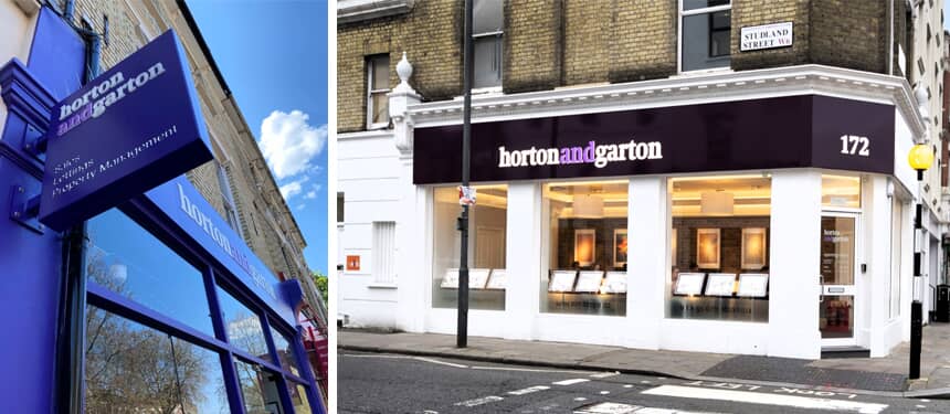
Estate agents, Horton and Garton were looking to modernise their signage throughout their office portfolio, modernising several workspaces, as well as branding a fresh office location, based on a busy London high street.
The Solution
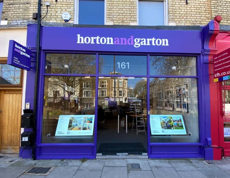
Working with FASTSIGNS® as their incumbent signage supplier, Horton and Garton knew the benefit of capturing attention with eye-catching signage, as well as integrating their business into the local community. With that in mind, FASTSIGNS created, applied and painted a 9.5m2 exterior building stencilled wall graphic, which dominated a street-facing wall of their property, overlooking the A4, a major road connecting West London to the City Centre.
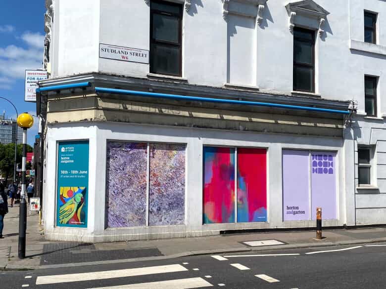
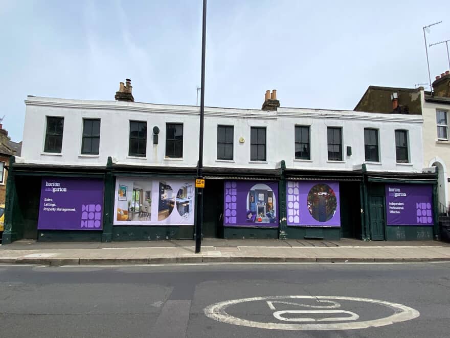
To further strengthen their ties with their community, having acquired their King Street location, whilst waiting for their fixtures and fitting to be built inside, FASTSIGNS helped Horton and Garton to showcase, not only their brand but also their philanthropic endeavours. Before their main signage was installed, FASTSIGNS fitted nine Foam PVC Panels in the building’s windows, showcasing a local art exhibition, which Horton and Garton were sponsoring. This effective use of signage created awareness of upcoming events and turned the exterior building into an attractive temporary art gallery, which tapped into the neighbourhood’s artistic undercurrent. The installation ensured the passing potential customers were aware of their business’ coming presence.
Helping Horton and Garton to raise awareness of their brand across South West London, FASTSIGNS employed a similar marketing tactic on an empty building on another local London road. FASTSIGNS recommended using temporary exterior signage in the form of five full-colour PVC banners. These banners were directly affixed to the exterior of the empty building. This addition of temporary signage delivered a marketing opportunity for Horton and Garton, as well as created a positive aspect for the building, while it stood empty.
Horton and Garton were excited to open a new office in Chiswick High Street. FASTSIGNS designed, built and installed an exterior fascia sign, consisting of two aluminium sign trays, which are internally illuminated and joined together seamlessly to represent the brand name with integrity. The logo lettering was stencil-cut from the tray, with opal acrylic inlays, to achieve an impressive luminosity. This sign tray was then affixed to a wooden fascia.
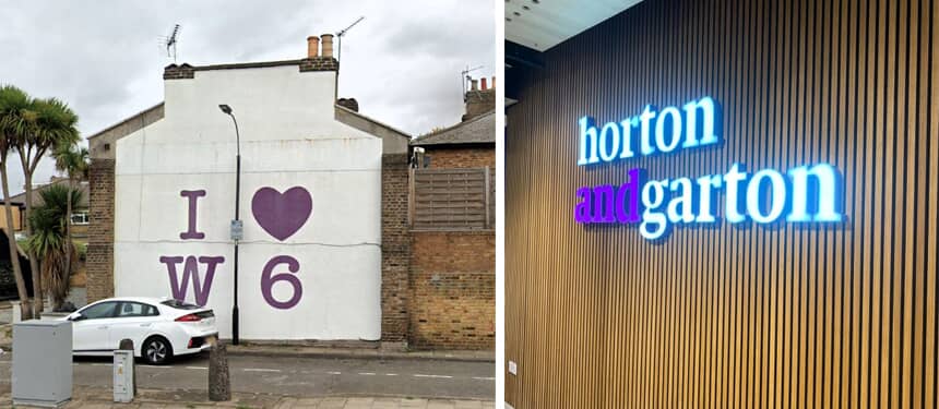
A double-sided, illuminated projecting sign, using the same production techniques as the exterior fascia, was also installed. The addition of this sign helps passing foot traffic identify the store from a distance as they approach its entrance. To complete the exterior, frosted vinyl was applied to the windows, featuring reverse-cut door numbers and opening hours—an understated yet impactful window graphic strategy. As part of the external display, a 55” window screen was mounted to the interior of the window, allowing the company to effortlessly communicate key messages and advertisements to passersby.
The interior signage received as much attention to detail as the exterior building sign. In the reception area a stunning 60mm deep built-up logo fashioned from stainless steel, with integrated illumination greets customers and visitors upon entering the premises.
The Result
FASTSIGNS helped Horton and Garton attract attention to their various locations through the use of quirky, yet on-brand signage, creating visuals for a business that is keen to tap into their local community’s artistic frequency.
*This project was completed by FASTSIGNS of Hammersmith.