Being responsible for a brand, whether in the field of marketing or graphic design or as a business owner aiming to impress customers, it is crucial to stay informed and updated on current trends. This helps to maintain relevance and ensure that your brand image remains consistent and visible across various platforms and environments.
Trends often signify changes in consumer preferences, design styles, and technological advancements. The experts at FASTSIGNS have observed that graphic, colour, and material trends that were popular in 2023 are still gaining significance and popularity. Trends often point to a cultural shift. Brands that appear out of date or out of touch can lose momentum with their customers and stakeholders. Using visuals that resonate can help your brand stay fresh and appealing. Not to mention, it can even help keep you more competitive in the business landscape. So for you, the brand and business stewards, here’s our annual recap of visual communication trends.
Minimal, Maximal and Natural Design Elements
Design continues to go back to nature with a focus on natural materials such as metal, wood, rust and patina. These types of visuals and signs not only catch the eye but also complement the environment with natural materials and a softer, more organic aesthetic. Bringing the outdoors inside continues to trend, and a lot of mossy visuals and logos will be seen out in the “wild.”
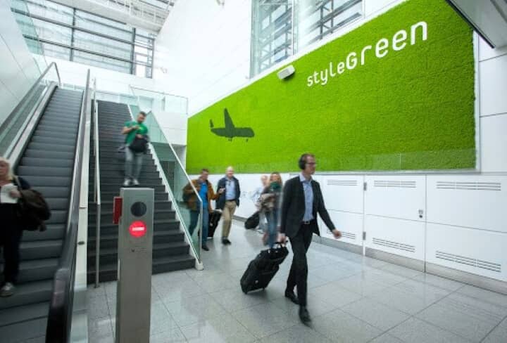
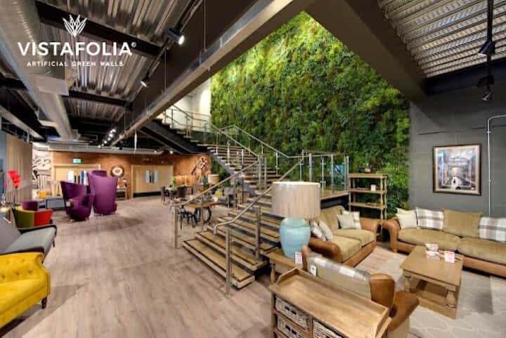
Consumers can experience the calming presence of the outdoors inside with live and faux greenery.
While the era of minimalism in home design is being debated as shifting or waning, its popularity in visual communication is growing with a focus on less clutter and more breathable space. The functional nature of minimalism in signage is evident in its visual impact. This trend allows brands to create a cleaner style, stripping away the unnecessary and cutting through the static of bombarding visual stimuli for greater clarity. A balanced use of negative space - the area of a design that is not occupied by any visual or textual elements and succinct typography create a haven, separate from digital fatigue for those yearning for authenticity, simplicity and the sense of well-being.
There’s also a growing trend of maximalism in design for visuals. Think larger-than-life lettering, dynamic colours and even complex patterns and textures used to attract attention and make a statement.
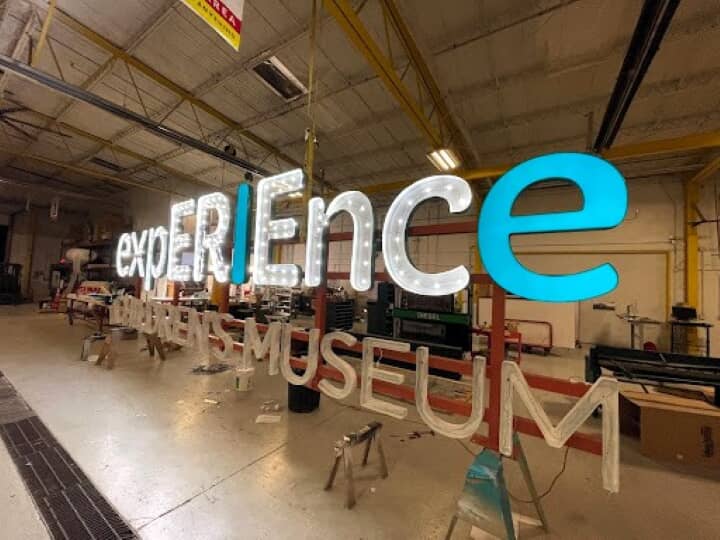

Maximalism creates an enhanced welcoming experience for museum visitors.
Another maximising effort of sign makers includes their layered approach to substrates such as decorative, frosted or hologram-type vinyl added to a second frosted or glass surface, giving it depth.
Sound is another aspect to consider when designing with experiences in mind. This is a trend that’s becoming more prominent. Marrying sound with visual solutions includes acoustic elements such as tiny wood slats, being incorporated into the design to cut down on sounds and echoes. Acoustic panels are also being used as an interior design and functional element.
Flexible Visuals
The days of rigid signage are behind us. Bendable neon offers a new glow to minimalist design that can twist and turn for any business logo or brand. Flexible neon can add depth and a cosy ambience that welcomes any customer or visitor into a space. Even decals have a flexible element, which means they can be applied on almost any surface, even if contoured, by using products like UV direct-to-print film. With interesting contoured pieces such as tables or curved walls, you can now use a conformable application like Instapaint that’s applied with water. Application on any porous substance such as brick, render and stone allows for a painted look that’s permanent.
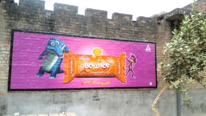
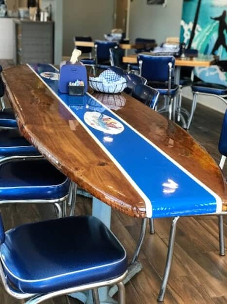
The canvas for visuals now encompasses everything from bricks on building exteriors to the tops of tables. Bottom Photo Credit: DDS MediTech
3D and Signage Depth
The concept of depth applied to custom signage truly makes visual solutions come alive – whether it’s larger-than-life characters on a building or layering lighted signs on a greenery wall to create ambiance.
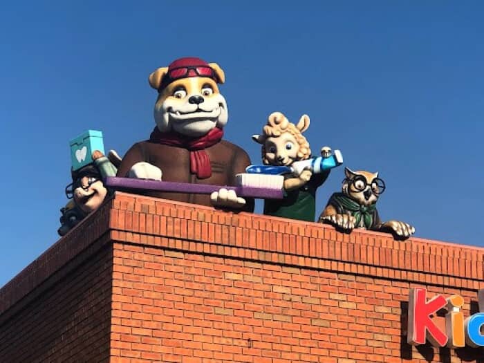
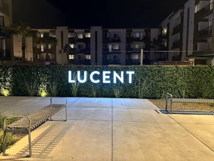
Signage depth can be added to exterior buildings, walls and more.
Depth has even come into play with the technology behind white inks and varnish. This trend is growing exponentially, which leads to increased tactile and unique embellishments showing up in prints. With this technology, 3D bubbles created from varnish, transform a piece of signage into a work of art. This technology is not only amazing to observe, but it also serves to benefit people. It enables sign makers to more easily print Braille, which formerly had to be created manually. Now, sign makers can employ a printer to layer pieces of substrate to become DDA Compliant.
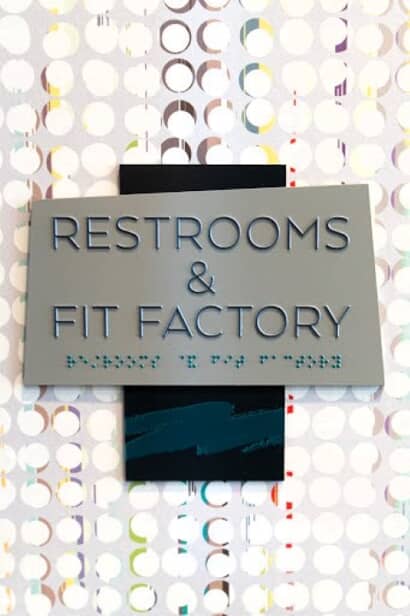
Sign creators can now bring Braille printing in-house.
Remaining relevant is important to maintaining a strong brand image and presence that’s engaging. We will continue to share insights to help you navigate the ever-changing realm of visual communications.
Stay tuned for our next instalment of sign and visual communication trends for 2024.