First Glance
A sign should first and foremost be functional. It has a purpose—to communicate. Any sign or visual graphic with word-based communication needs a typeface and font that is easy to read. It is important that your chosen type be consistent with the image your brand is projecting, and that it looks good and is readable on all of the marketing materials, decor and signage throughout your business or facility.
What are some of the easiest to read? Let’s explore the options and how the right type style choice can increase legibility and message retention.
Sans What?
Serif Fonts
Serif is defined as a short, finishing stroke at the end of each stroke in a letterform. They are also referred to as “feet”. A large body of text is easier to read if it is in a serif font because the feet help guide the eyes from one letter to the next.
Sans Serif Fonts
Sans is a French word that means “without”. Sans Serif fonts are generally used for headlines or standout titles. Their clean, simple appearance helps them stand out.

Script Fonts
A typeface that appears to be hand-lettered by pen, brush or pencil is a Script font. It can add elegance to a design but moderation is key. Script fonts are not intended for body copy or heavy usage. Compare the script font to the sans serif font in this example. Which one is easier to read at a glance?

Easiest Fonts to Read
There are countless font choices available. As more become available, your head may spin at the options. In the industry, we refer to some of these display fonts as “out in the wild” as they are often fadlike. When it comes to the signs and graphics that will be the face of your business or organisation, tried and true classic fonts will not lead you astray. Here are five of the easiest fonts to read:

Futura is easy-to-read thanks to its geometric design. The straight lines and shapes of the letters are easy to view and visually comprehend. This geometric design and versatility make it great for a modern brand.

Adobe Garamond Pro is another classic font created for utilitarian reasons and has stood the test of time. It is a typeface with serifs which are generally reserved for blocks of copy; this could be ideal for smaller text on your sign. Garamond is elegant with light letter strokes and open negative spaces.

Bodoni is a professional, stylish font with thick and thin strokes that convey a distinct personality. The thick and thin contrast in the letterforms is great for signage.

Simplistic, bold and powerful, Franklin Gothic easily conveys its message. The width of each character is narrow compared to Helvetica and Futura, While some perceive it as being squashed, this style may suit your brand nicely.

Some Designers feel Helvetica it is overused. Yet, it is overused for good reason: it is easy to read and well... it just works. The Helvetica family now has 51 different font weights and is a “go to” sans serif font.
Location, Location, Location
As you consider which font is best for your branding and your signs and graphics, it is important to also consider where the signs will be placed and the viewing conditions. Indoors or outdoors? What is the sign’s function; is it directing traffic in a busy parking lot or adorning a 20 story building? For signs that are large, letter size and font type is key as these signs will be viewed from a much further distance and potentially at a high rate of speed. To increase legibility in this case, the font size needs to be larger and the style choice should be readable and clear (read: NOT a script font).
Fonts are Fun
It can be fun to choose a font from the endless sea of options that are available, but narrow your selection down to no more than two fonts for any one sign. Then, each sign and visual graphic should also carry the same two fonts throughout for brand consistency. Consider using a bold and a regular version from the same font family to achieve a nice contrast of thick and thin line weights.
Oooh, Colours!
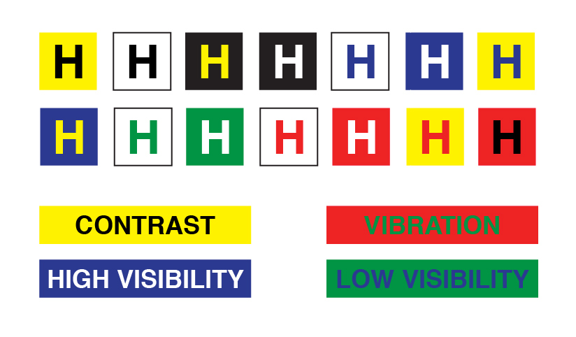
Choose carefully and be selective with colour in your sign design and layout. Contrasting colours can make an impact but, again, the surrounding environment where the signs will be placed should be taken into account. Black and white combinations always work well as do yellow on black, which is why these combinations are used for traffic and construction signage. When tying in your branding and its colours, keep contrast and visibility in mind as some combinations can be difficult on the eyes, making reading them a challenge.

FASTSIGNS Recommended Do’s and Don’ts
Do
• Use contrasting fonts that complement each other and are pleasing to the eye
• Use Scripts very sparingly
• Use concordant (agreeing; harmonious) fonts for a classic subdued look
Don’t
• Use fonts that are similar in character and look
• Use all uppercase in a Script font
• Use more than 2-3 fonts in a sign design
Select typefaces and fonts that effectively communicate your message, image and design needs. Keep the type of sign and it’s environment in mind and remember to be clear, be concise and resist the urge to use a Script font (or comic sans). Less is often more.