In the UK, the average person spends over 1,675 hours per year in their place of work. In recognition of this many employers are striving to find ways to make their working environment a more comfortable and engaging place for staff to be. As a result, the demand for signs, graphics and visual communications as office decor has increased.
When considering how to decorate an office space or facility, there are lots of things to consider before settling on the final design aesthetic. Firstly, the physical elements of the building can play a role in determining the most suitable types of signage for the available space. Other considerations are how a company logo could be incorporated into the designs and the type of work that the business focuses on.
Colour also has a significant impact on the finished designs for interior decor, the colours that are used can have a huge impact of workplace productivity and can often be derived from the industry and type of work the business conducts.
Let’s consider how colours are used to elicit productivity in different industries.
Blue
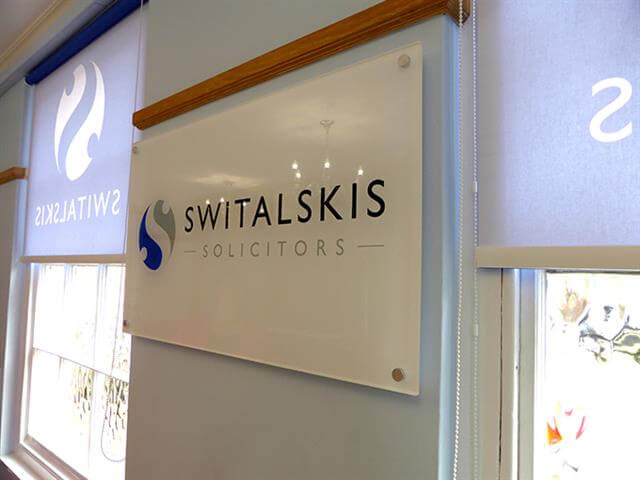
Blue tones are often used by solicitors and legal brands, this colour promotes trust and calmness and is used in workplace environments that require focus, concentration and attention to detail.
White
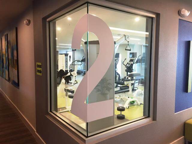
White suggests cleanliness and instantly makes people think of clinical environments like hospitals or dentist surgeries, too much white can be distracting and unsettling, it is recommended that this colour should be used sparingly to accent another colour.
Yellow or Orange
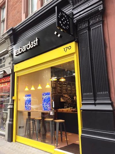
The vibrancy of these colours instantly generates energy, these colours work extremely well in creative environments, helping people to innovate and think outside of the box.
Red

A colour that has a wide variety of meanings from love to danger, in a workplace environment, such as a factory floor, red can be used to catch people’s attention and produce some form of call to action. Like white, used sparingly red can have a great impact.
Green

Used in a pale tone, green can have a calming effect with links to nature and helps to reduce anxiety, a great colour to use in break rooms and healthcare facilities. Bold green shade can be as energising as yellow or orange and are often found in creative office or within fitness enterprises.
Pink

Associated with the female gender, pink can be a colour that portrays strength and warmth if a business is aimed a feminine target market and workforce, using pink tones in your office space can reinforce brand messaging. Pink can also be used to shock, much like red, it elicits a call to action.
Whilst the use of colours is generally accepted per industry, there is no hard and fast rule as to how you use colour in your interior decor. Our signage specialists will work with you to use your brand’s colour pallet to create an aesthetic that is suitable for your working environment, reflects your brand, the work you produce and help you to create a space that inspires your workforce daily.