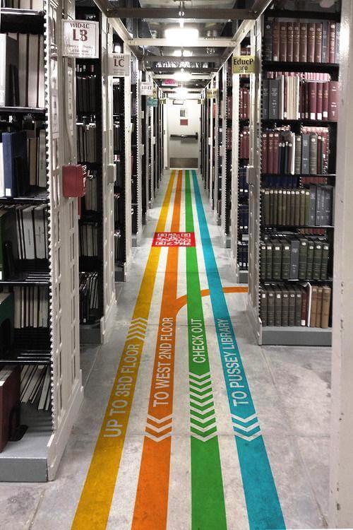
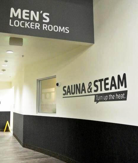
When it comes to developing directional and wayfinding signage it’s important to achieve a balance between the practicalities of the signage and the aesthetics of your brand. In terms of practicality, your directional signage should silently control and organise the flow of people moving around facilities and events. Aesthetically, your signage should be designed as an extension of your brand, taking its direction from your designated colour pallet and design themes.

Getting the balance just right can be achieved through thorough planning and consideration of your brand, the message and image you wish to portray and the space available to create easily navigable way finding signage.
One of the first things to consider is how your directional signage will be displayed in your environment, working with the structure of your facilities will help to keep your signage looking in keeping and part of the design.
Structural columns or blank expanses of wall are great places to use wall graphics to not only bring décor into your facilities but to also incorporate wayfinding signage. Floors are also a great place for directional signage and can encourage your visitor to simply follow their feet when walking around your facilities. Using colour from your brand palette, assign a colour to areas of your business and have hard wearing floor graphics in the same colour leading to these areas.

The material your signage is made from can also have a great impact on the visual aesthetic of your signage and is an important factor to consider when developing the overall look and feel of your finished signs. If your brand is sleek and sophisticated, consider using brushed aluminium or steel as a base material for signs, or even as an accent to draw the customer’s eyes to your sign. If your brand is playful and uses bright primary colours and strong shapes, hard wearing acrylic signage could be a perfect material to achieve this particular look. Does your brand’s culture focus on environmental awareness? Consider using reclaimed wood or recycled plastic as part of your design to under pin your brand’s ethos.

When considering the wording for your signage, be creative and brand aware, consider names for your meeting rooms, break rooms or function rooms that play to your brand’s name and culture, this will help to submerge your visitors into your brand and create a seamless visitor experience for them. Talk to our team of signage experts. We’ll work with you to bring all of your business’s colours, fonts and quirks together to create a space that’s people will enjoy navigating!