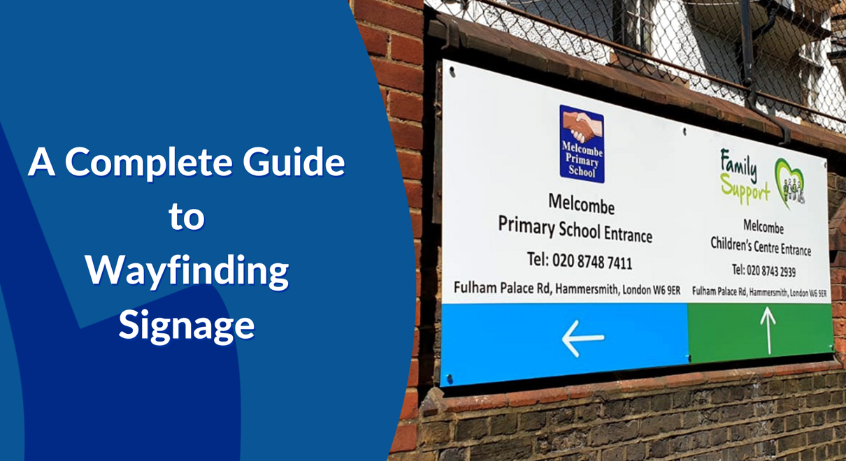
When you enter an unfamiliar or busy place such as a hospital, urban area or event, it’s second nature to scan your surroundings for information, which is usually provided by wayfinding signs. Once you’ve digested the information provided, you’re ready to strike off to your next destination. If you find it easily, you gain a sense of achievement, your trust builds in your environment and you have a great first impression. The simple and natural act of seeking information is your first interaction with a business’ wayfinding signage.
Wayfinding signs are important for guiding your visitors around the whole of your site. From the moment of their arrival, wayfinding signs direct them to your car park and receptions, allowing them to navigate your facility without additional assistance. If your wayfinding solution is clear and informative, and visitors can explore your premises with ease, their perception of your business can be boosted beyond measure!
In order to provide clarity through your wayfinding signage, there should be a large number of signs distributed throughout your facility. This is a fantastic opportunity to enhance your space, by customising signs to fit your company’s image. Whether your business is a vibrant and fun-loving event space, or an on-the-ball legal firm, the signs you display showcase your brand. If your signage design matches how your customers perceive your brand, it's a surefire way to build their confidence in your service.
Visit our wayfinding product page for more information on how we can support you with implementing wayfinding signage in your business.
What is Wayfinding Signage and Why is it Important?
A custom wayfinding signage solution is a collection of signs that are spread throughout a business's building or facility. These signs work together to help business users such as staff, customers, visitors or students to access and navigate the premises with ease.
Effective wayfinding signage offers so much more than just directing. For example, educational establishments use wayfinding signs to manage crowd control. Large numbers of people traverse corridors to reach their next destination on a daily basis. Without wayfinding signage, the time between classes could be chaotic. By installing wayfinding signs that direct students to different areas of their campus, it ensures, and communicates, that the managing body of the education facility has considered their duty of care to their students.
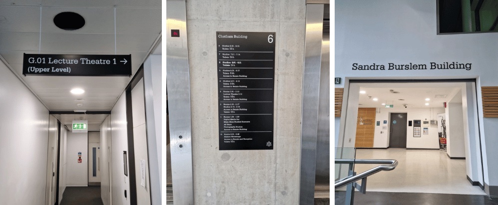
FASTSIGNS helped Manchester Metropolitan University implement over 900 signs across their campuses, By doing so, they helped to improve their student’s safety by ensuring that they can easily navigate the corridors on a day-to-day basis, as well as preparing for unexpected emergencies. The functional elements of their signage help to ensure that their setting is accessible to all users. For example, the black and white colour scheme used in their signage provides an effective contrast, ensuring the information delivered is highly legible. Therefore, these signs help their students to have the best possible experience of the university site, demonstrating that they prioritise their student’s welfare.
Wayfinding Signage vs. Directional Signage
Directional signs are part of the wayfinding signage family. They should be used as part of a holistic wayfinding solution, which prioritises the experiential flow of the business’ full site.
Wayfinding signs can be broken down into four types of signs, which work together to deliver a comprehensive custom wayfinding solution, these include:
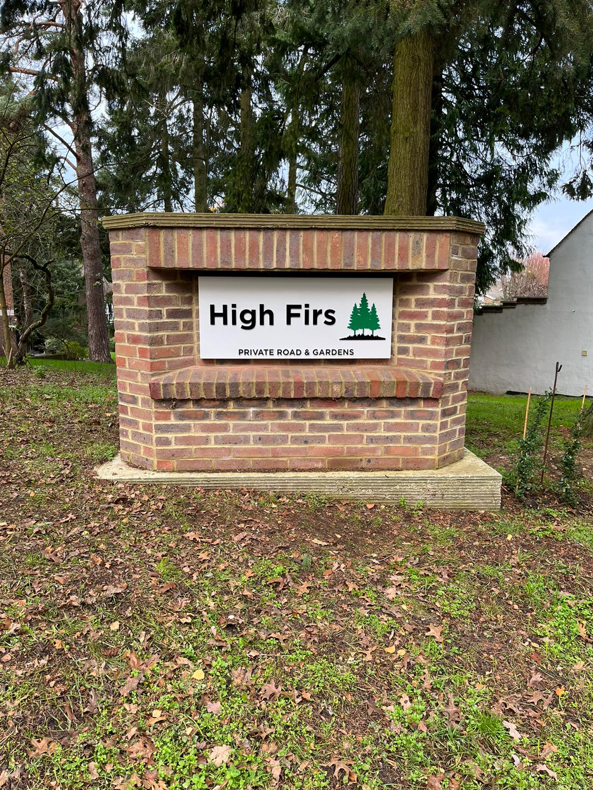
Identification Signs - These signs mark out locations through the use of door plaques, location markers or landmark signs, telling people they’ve reached where they were heading.
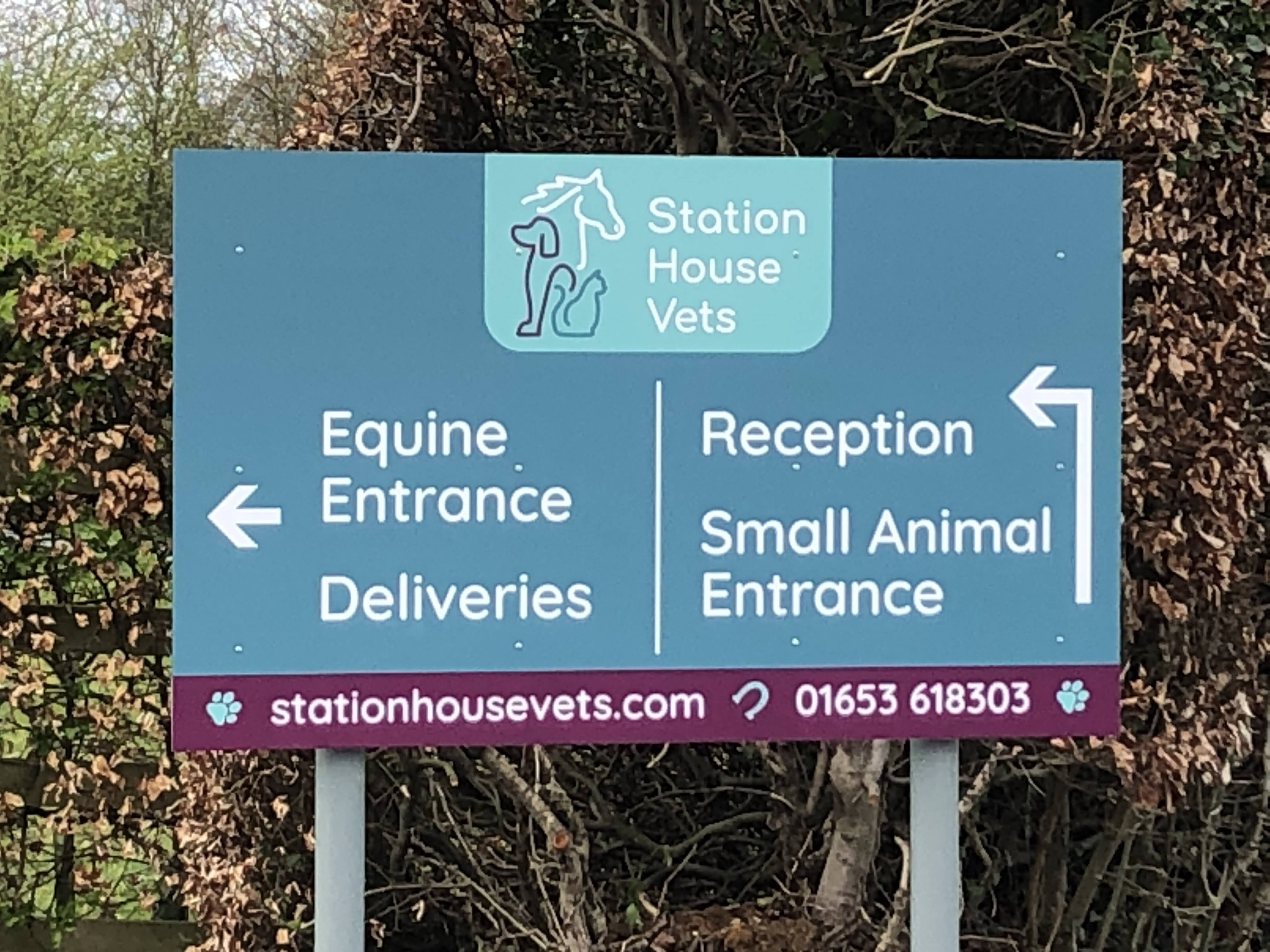
Directional Signs - These signs help people to decide their next move. They indicate whether to turn left or right at junctions or to change floors to get to their destination. These signs can be simple or utilise colour to identify different departments and use corresponding map references to provide as much information as possible. If anyone gets lost on their journey from A to B, the wayfinding solution needs to be reviewed.
Informational Signs - These signs indicate amenities such as toilets, water stations or provide terms of service like opening hours. These signs care for the well-being of the user.
.jpeg)
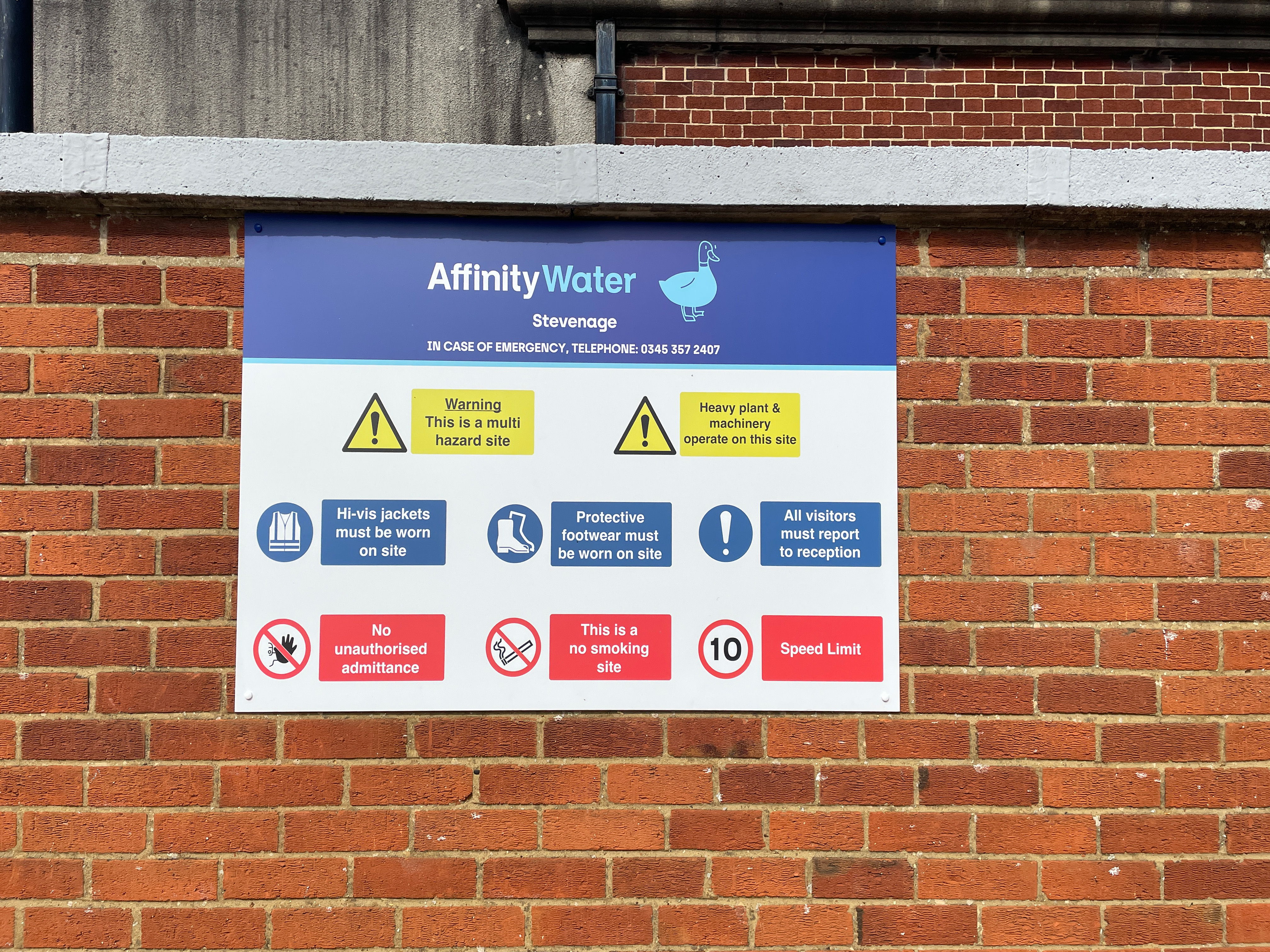
Regulatory Signs - These signs tell people how to behave. They focus on keeping people safe and consider potential hazards by providing clear warnings and instructions. These signs are usually standard pictorial signs, such as ‘No Smoking’ or No Entry. These create clear boundaries which the general public observes.
Types of Wayfinding Signs
There is no ‘one size fits all’ wayfinding system! Your requirements, facility, location and budget will determine the types of signage we recommend to create your custom wayfinding solution.
Typical wayfinding solutions could include:
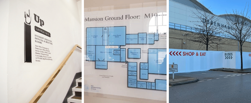
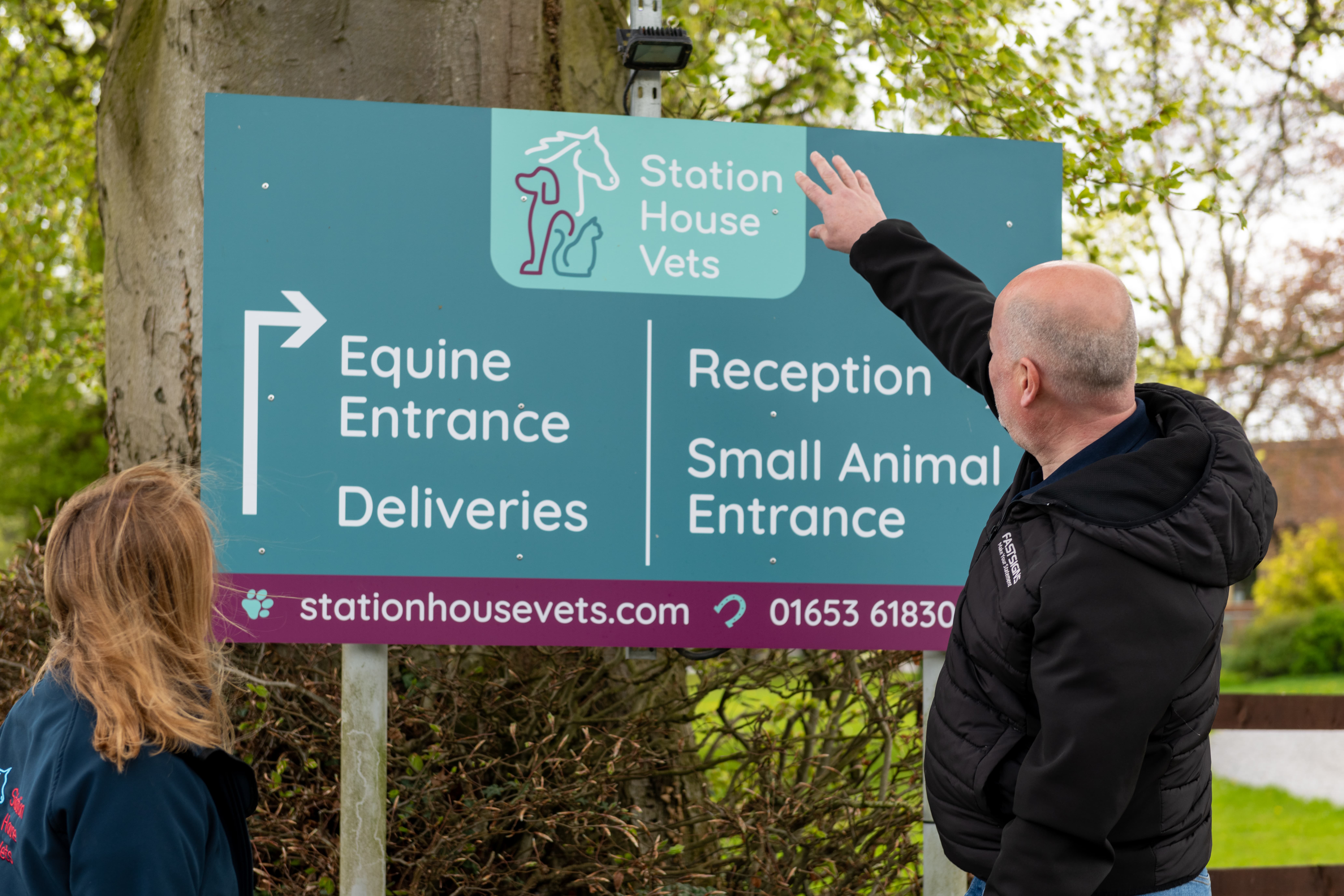
Post and panel road signage - often positioned a little way from your business, these signs act as great indicators of approaching turnings and venues.
Totems or Monolith Signs, situated at the entrance to your car park, these signs direct the way to key points of your site, such as receptions or loading bays.
Exterior Building Signs act as identification signs. They could show your business name and logo, or highlight destinations.
Directories and Plaques could be positioned by stairwells or lift banks to provide information about the different levels of your building, such as floor numbers.
Signposts are a great way to point customers in many directions, utilising a small space footprint.
Wall Graphics are a great way to share wayfinding information using available space in your facility
Floor Graphics can guide visitors to key locations, creating opportunities for sharing information and promoting themes.
Banners and High-Level Signs are great options for exhibition events or for guiding guests around your corridors.
Door Identification including braille and tactile features is often the final piece of the puzzle. These signs are affixed to doors that identify the end destination.
Design Principles for Wayfinding Signs
When designing wayfinding signage, there are certain principles that need to be considered. Firstly, although the function of wayfinding signs is to help people navigate the facility, the number of signs within a solution could be numerous, so it's a no-brainer to use these signs as a place to showcase your brand. Adding elements of your branding to these signs creates an opportunity for stakeholders to become immersed in your brand.
Legibility is also important, to make a space accessible for all users. Having a high contrast between your sign background and lettering helps people to easily read the information provided. Depending on your brand colour palette, our signage experts will suggest the most appropriate colours to use. The colour scheme that provides the best legibility is dark text, such as black, blue or grey on a white background, however utilising a dark background with lighter text is also extremely effective.
Our signage experts will also look at other elements of your branding, such as fonts, to see if they can be implemented into your wayfinding design. The best fonts to use on wayfinding signs are clear and consistent. Great examples of fonts we would recommend are Helvetica or Franklin Gothic. The text on your wayfinding signage will be used consistently but depending on the placement of the sign in the building the text size may be increased or decreased appropriately. For further information, check out our recent article on which typefaces and fonts are the best to use for signage.
By having wayfinding signs that incorporate branding and stylistic features, which promote ease of use, you’re creating a polished finish to your setting. This design feature tells your customers you have considered their experience, and assures your staff that they work for a business that takes pride in the smallest of details. This helps to underpin your brand identity at literally every turn!
Implementation & Maintenance Tips for Wayfinding Signs
When implementing wayfinding signage, it’s important to consider the whole site. This will help you to maintain consistency in your wayfinding solution, allowing you to identify destinations that may need to be considered from many initial starting points. Our signage experts conduct thorough site surveys, auditing the location, your requirements and current fixtures and fittings. We then create a design concept, before working with you collaboratively to add the directional detail to each sign. We’ll send all signage designs to you for your approval before production starts!
As with anything, maintenance is required to keep your wayfinding solution in tip-top shape. Depending on the materials used to produce your signage, your signage expert will provide information on the appropriate cleaning and maintenance needs. To make certain your wayfinding solutions remain effective, we would recommend completing an audit every six to twelve months. By doing so, you can ensure that any recent changes to room numbers, names, destinations or locations are reflected in your wider signage solution.
In Summary
Custom wayfinding signage is used to help your customers, visitors and staff to navigate the whole of your premises, providing important information that will help them engage with the site positively. Wayfinding signage creates unparalleled branding opportunities in your building, allowing customers and staff to feel valued and connected to your brand.
An effective wayfinding solution will look at your site holistically, ensuring that identification, directional, information and regulatory signs are considered. Depending on the space available, the types of signs will be tailored perfectly to your business. If you’d like to develop your wayfinding signage, request a quote at FASTSIGNS today.
