Guiding people around and through your building or campus quickly and safely is the main job of wayfinding signs and graphics, but the job isn’t complete if your signage is not fully compliant. Wondering what compliance actually looks like? Here are some things to “guide” you on your way to a more compliant space:
#1. Provide Clear Direction
From directories to floor levels, signs and graphics can provide navigation in emergency situations. Keep messaging, fonts and colours consistent. Including signs on emergency storage rooms can also quickly direct everyday heroes to locations for where life-saving tools are located.
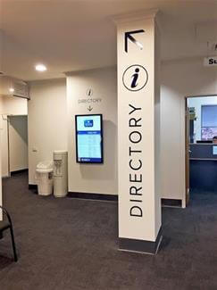
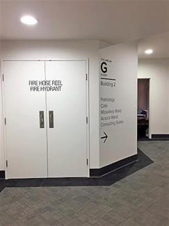
#2. Locate Amenities
Bold and easy-to-read bathroom signage could make all the difference in helping all guests feel comfortable in your environment. The Disability Discrimination Act (DDA) recommends using contrasting colours, including braille and tactile elements and installing signage at a specific height so everyone can digest the information provided effectively.
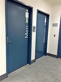
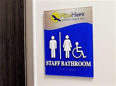
#3. Locate Exits
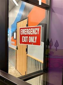
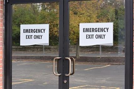
Keeping emergency exits clearly labelled could help you in an emergency situation when you need to evacuate quickly. Having identifiable exit signs to inform your visitors, staff and guests help them to leave in a safe and effective manner.
#4. Ensure DDA-Compliance Throughout
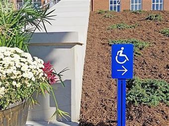
DDA-compliance requires accessibility in a space. From your parking area outside to ramps and room designator signs that include braille, make wayfinding simple for everyone. Contrasting colours can make DDA-Compliant signs more noticeable and stand out to attract attention. By ensuring your signage is DDA-compliant throughout a space, you can deliver a more inclusive space.

#5. Classify Dangerous Areas
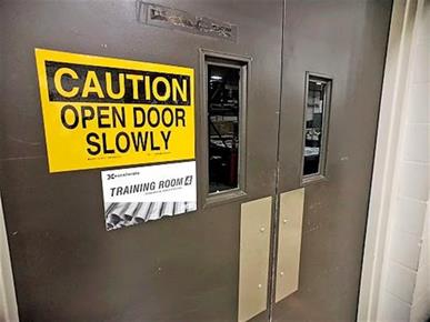
Advise precaution and warn others when there are potential threats to personal safety. Caution signs can direct traffic around or safely through a highly-dangerous area. By using contrasting colours on danger zone signs, you provide higher visibility for observers. For accessibility, install warning and caution signs at eye level for best adherence to proper practices.
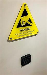
Regulatory wayfinding and directional signs help visitors know what to expect as they move throughout your space. Ensure that your wayfinding signs and graphics are regulatory compliant to help keep visitors, staff, students and patients safer and well informed.
Need new wayfinding signs or graphics? FASTSIGNS is here to help with all of your signage needs.