Signs are designed to do one of three things: Sell, Inform & Direct. Whether you are the Facilities Manager of a large retail environment or a local, neighbourhood Butcher, your signage and graphics should accomplish something for your business. Our 10 top tips will give help you consider whether your current signs are effective or help you to understand why your business visibility is suffering.
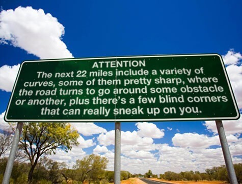
1. Use the 7 word rule: The human eye can take in 7 words at a time. Don’t try and cram too much information in to one space.
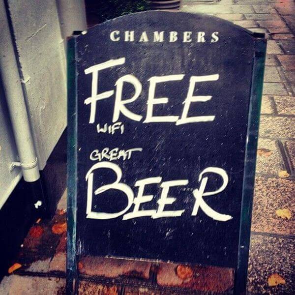
2. FREE BEER! Use different sized lettering to lead your audience to the most important information about your business or event. Did you see the small print the first time?
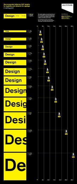
3. Struggling to get your message across? Choose your lettering size carefully to maximise the visibility of your sign – see the table below for the best sizes of lettering and the optimal reading distance.
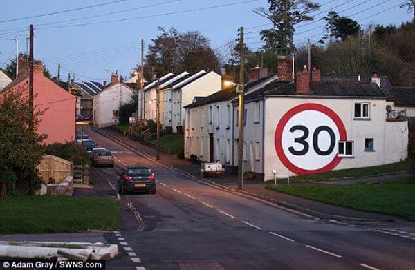
4. Use a combination of colours and fonts to create interest – just don’t use too many! Type sets often come in groups. Use one or two, and no more than three, to add interest to your design.
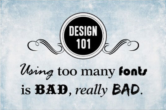
5. Don’t forget to consider the alignment of your words and images or this can throw the design totally off-balance.
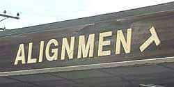
6.

7.

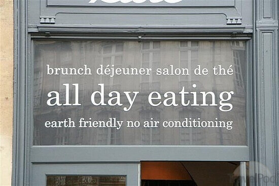
8. Adding a second colour to your sign increases its visibility by 75%.
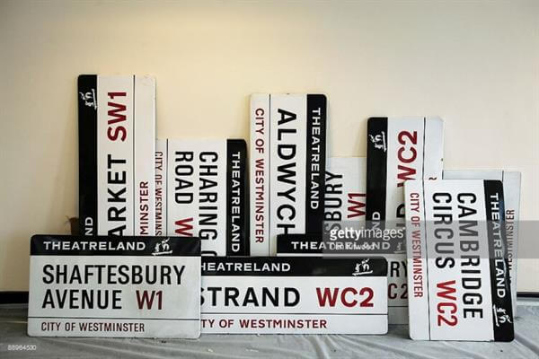
9. Using an image or logo on your sign increases message retention by 300%.
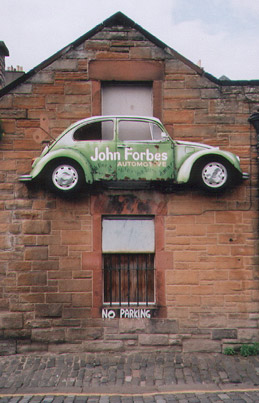
10. Always get someone to proof read your design before having it made – this can save your business from an embarrassing and costly mistake!

Stick to these rules when designing your next signage or graphics project and you should see your business visibility go through the roof!
Not sure where to start? Contact your local FASTSIGNS centre for help or advice on ways to increase your business visibility. www.fastsigns.co.uk/locations